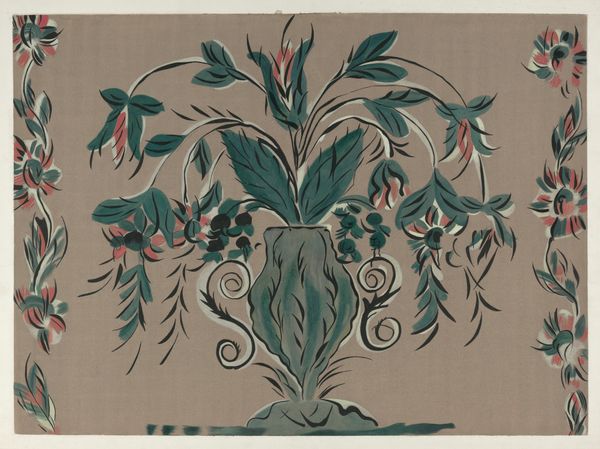
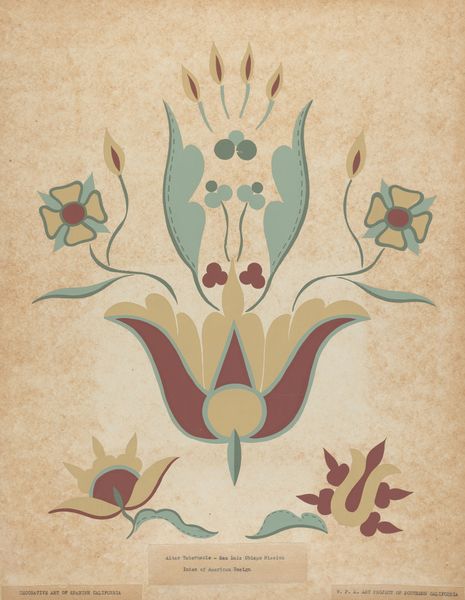
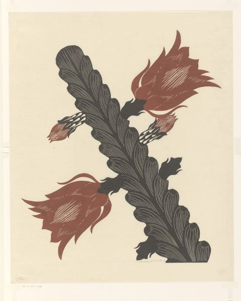
drawing, watercolor
#
drawing
#
organic
#
blue ink drawing
#
watercolor
#
decorative-art
Dimensions: overall: 33.3 x 24.1 cm (13 1/8 x 9 1/2 in.)
Copyright: National Gallery of Art: CC0 1.0
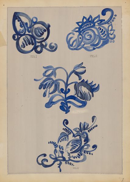
Curator: Let’s take a closer look at “Decoration for Stoneware,” a drawing in watercolor and blue ink created by A. Zimet between 1935 and 1942. What's your initial read? Editor: It feels immediately calm, yet stylized. The repeated organic forms—botanicals perhaps—arranged almost like motifs on textile or wallpaper samples. There's something quietly pleasing about the limited palette against the warm, tan background. Curator: Exactly. It’s fascinating to consider this within its historical context. This period, marked by both economic depression and brewing global conflict, witnessed a resurgence in interest in the decorative arts. Designs like these, intended for mass production on everyday objects such as stoneware, aimed to bring beauty into ordinary life, and stoneware was also important to functional art movements that valued craft production as important socially and esthetically. Editor: It strikes me that Zimet chose predominantly plant-like images and shapes. Perhaps reflecting an era when engagement with the organic world was deeply embedded in the human experience and its social construction, rather than perceived separately. I see each carefully crafted illustration and wonder whether it was consciously an act to emphasize, explore or interrogate that link? Curator: Absolutely. There’s a quiet, subversive quality here as well. Remember that while overtly promoting harmony and accessible beauty, designs, choice of medium and imagery often subtly questioned class and social structures by prioritizing useful accessible works of art. The relative accessibility of materials and democratic aesthetics certainly could serve the broader project of building solidarity in response to inequality. Editor: So the image of organic life, like this, wasn’t simply ornamental—it functioned as a powerful reminder of both humanity and place, a connection increasingly fractured within industrial capitalism. I see now why the piece still feels relevant; those struggles with capitalist structure persist. Curator: Agreed. And considering the deliberate deployment and role of this watercolor as a potential means for the decoration of stoneware, for bringing inexpensive beauty into people's everyday surroundings. It offers us, today, important historical narratives to think about that weave throughout craft, history, capitalism, the economy, class and access. Editor: What an unexpected complexity found in what seemed like mere decoration! Curator: Indeed! A reminder to always look beneath the surface.
Comments
No comments
Be the first to comment and join the conversation on the ultimate creative platform.
More like this