drawing, pastel
drawing
figuration
11_renaissance
coloured pencil
pastel
history-painting
nude
watercolor
Dimensions: height 129 mm, width 88 mm
Copyright: Rijks Museum: Open Domain
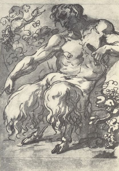
Editor: This is "Bacchus," a drawing made around 1592 by Hans Rottenhammer. The materials look like pastels or watercolors on paper, maybe with some colored pencil? I'm immediately struck by the sketchiness of the drawing, like it's capturing a fleeting moment of revelry, but what do you make of it? Curator: Ah, yes, Bacchus in all his divine drunkenness! I see a playful study in contrasts here, don’t you think? The god of wine is rendered in these muted tones, almost a whisper of color. Yet, the subject himself—overflowing with life, literally overflowing with wine!–suggests unrestrained energy. Imagine Rottenhammer capturing a god not in glorious perfection, but in mid-imbibe. Do you think it challenges or reinforces his divinity? Editor: That’s interesting, it does feel a little irreverent. Maybe more human, certainly more approachable, than I would have expected a god to be depicted back then. But is it also a study in composition? All the figures seem to be arranged almost to fit into a triangle? Curator: Precisely! Note how he uses the dynamism of Baroque art, yet nestles it within this Renaissance pyramidal structure, all those figures supporting each other? There’s a sense of controlled chaos – the party can rage, but within the artist’s vision. Though personally, I think Rottenhammer just had a soft spot for Bacchus and a good party himself! Editor: So it's both about the party and about the painter’s hand guiding the chaos! I hadn't considered how much intention could be behind something that appears so free-flowing. Thanks for pointing that out. Curator: My pleasure. Sometimes, the most profound artistry lies in making the complex feel effortless, doesn’t it?
Comments
No comments
Be the first to comment and join the conversation on the ultimate creative platform.