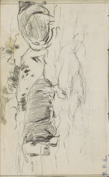
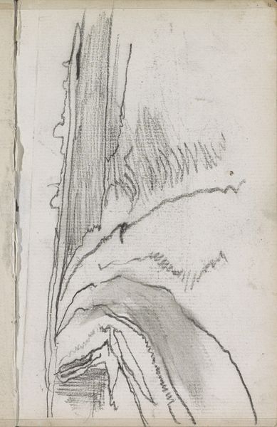
drawing, paper, pencil
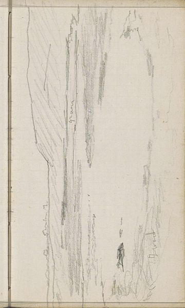
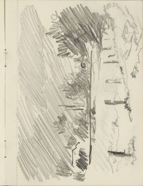
drawing
pencil sketch
landscape
etching
paper
form
pencil
line
Copyright: Rijks Museum: Open Domain
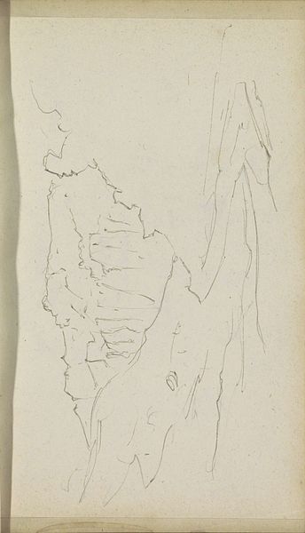
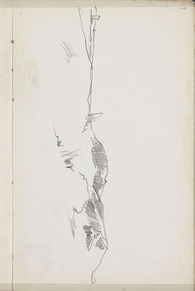
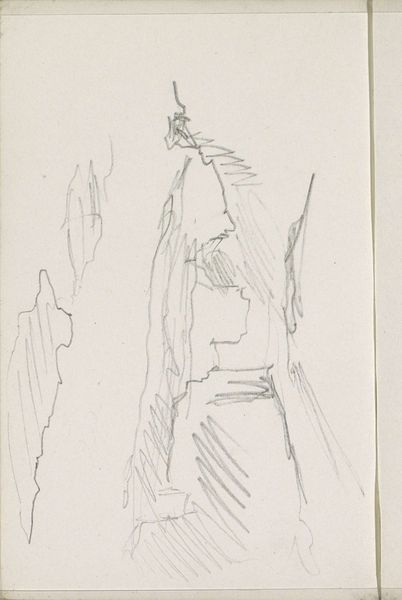
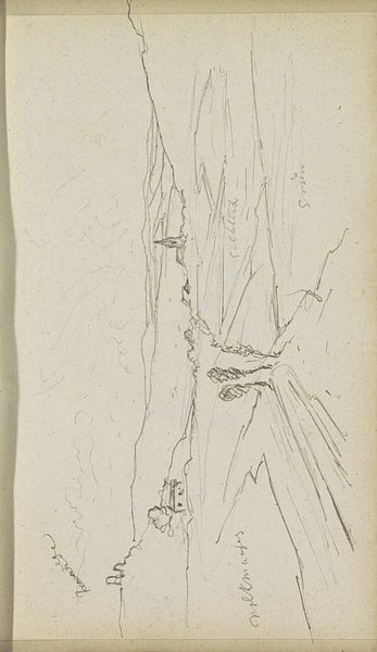
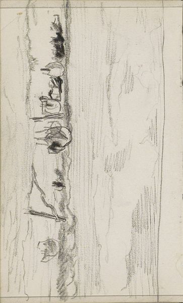
Editor: Here we have Reijer Stolk’s "Rotskust," a pencil drawing from around 1916, currently residing at the Rijksmuseum. It's a pretty stark, almost severe composition, all jagged edges and sharp contrasts. It’s...unsettling, really. What do you see in it? Curator: Unsettling is a fantastic word for it. To me, it feels like staring into the raw, unfinished potential of the landscape itself. Stolk isn’t presenting a postcard view; he's wrestling with form, isn’t he? You can almost feel him searching for the soul of that coastline with each stroke. Have you ever felt like you're trying to capture something that keeps slipping away, just beyond your grasp? Editor: Definitely, I get that. The lines seem so tentative, but there’s also a confidence there. Almost like he knows exactly where he’s going, even if we don’t. Do you think the lack of detail is intentional, or is this more of a preliminary sketch? Curator: Ah, there's the million-dollar question! It's both, perhaps. There’s a conscious reduction happening – paring down the scene to its barest essence. That allows us, the viewers, to complete the picture with our own imaginations, doesn't it? I’d wager Stolk wants us to feel the wind, the grit of the rocks, the ceaseless push and pull of the sea…all from these humble lines. Editor: I never thought of it that way. So, it’s not about what's there, but what isn't. Almost like the negative space in music. Curator: Precisely! He gives us the notes; we compose the symphony. And isn’t that the magic of art? Editor: Absolutely. It really shifts how I see this piece. What started as unsettling now feels...inviting. Curator: Exactly! I think we've both learned something about looking at art, haven’t we? It's less about seeing and more about feeling and sensing.
Comments
No comments
Be the first to comment and join the conversation on the ultimate creative platform.