graphic-art, print, typography, woodcut, poster
#
graphic-art
#
art-nouveau
# print
#
typography
#
woodcut
#
poster
Copyright: Public domain
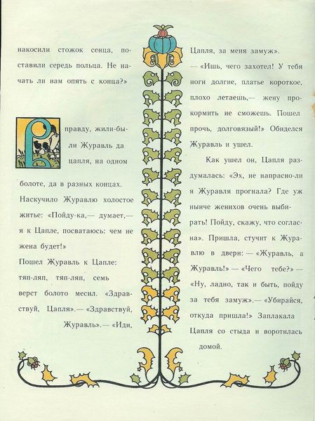
Ivan Bilibin made this illustration for the book *Living Word* sometime around 1907, probably using ink on paper, but maybe it’s a woodblock print. I love the flat ornamental patterns Bilibin has used. It’s such a clever design, this combination of calligraphic text, leafy borders, and stylized folk motifs. The way the red ink sits on the page, so crisp and graphic, is like a process of slowly layering information, one line at a time. Look at the patterns; they suggest the leaves and fruits of some fantastical plant, but they're also so simplified, each form defined by its black outline. It reminds me of Matisse's cut-outs, but with a uniquely Russian sensibility. Bilibin was part of the Mir iskusstva movement, which drew inspiration from Russian folklore, and you can really see it here. It's a timeless piece, isn't it? You can see the way it echoes earlier folk art while foreshadowing later developments in modern graphic design. It embraces contradiction, and that’s what makes it so good.
Comments
No comments
Be the first to comment and join the conversation on the ultimate creative platform.
More like this