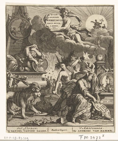
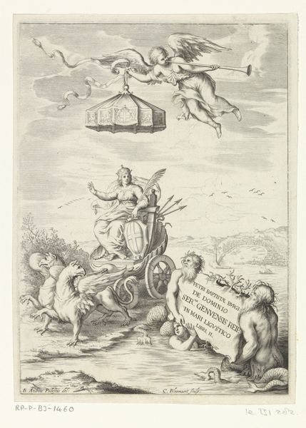
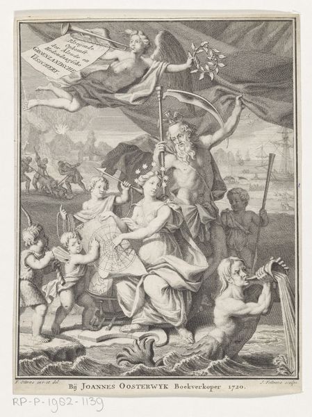
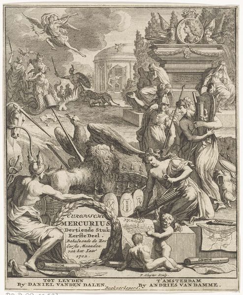
Titelpagina voor: Europische Mercurius Veertiende Stuk Eerste Deel, 1703 1703
0:00
0:00
pietersluyter
Rijksmuseum
graphic-art, print, engraving
#
graphic-art
#
allegory
#
baroque
#
pen drawing
# print
#
pen illustration
#
old engraving style
#
history-painting
#
engraving
Dimensions: height 162 mm, width 135 mm
Copyright: Rijks Museum: Open Domain
Curator: Good morning! Editor: Hello. We are looking at "Titelpagina voor: Europische Mercurius Veertiende Stuk Eerste Deel," from 1703. It's an engraving and pen drawing currently housed in the Rijksmuseum. I'm struck by the complex composition, it’s really quite a busy image, very Baroque in its density and layering. What jumps out to you as you examine the formal elements? Curator: Precisely. Notice how Sluyter uses contrasting textures and tones. The cloud-like background is filled with cherubic figures versus the angular architecture and figures in the foreground which introduces tension. Look, too, at the strong diagonals directing our gaze, a critical structural element of Baroque art. Consider how this emphasis manipulates depth and focuses our vision. Where do your eyes land first, and why do you think that is? Editor: I think I'm drawn to Mercury, and the cascading light... and perhaps because the text block draws my eye too, placed to the right. The muscularity of the figures is also arresting. Curator: A key point. The use of pronounced musculature and dramatic poses emphasizes vitality. The human form becomes a vehicle for conveying ideas about the strength and dynamism of European thought during the Enlightenment. Mercury in particular embodies that intellectual dynamism. The symbolism merges with the technical skill evident in the line work. How does considering the title with all its textual emphasis play out, formally? Editor: Thinking about the title… well, it’s visually integrated. Almost like a banner being presented… Formally it emphasizes the "Europische Mercurius", a printed serial, whose message or "reason" is literally pushed forward. And this blends form and function since it _is_ an elaborate title page. The architecture forms an allegorical proscenium arch! Curator: I find myself continually fascinated by the way the graphic work serves more than one function: The interplay of text and image generates powerful and persuasive cultural significance in Baroque imagery. Editor: I will be more attentive to the formal composition, next time, while looking into the cultural intent!
Comments
No comments
Be the first to comment and join the conversation on the ultimate creative platform.
More like this