drawing, graphic-art, print, paper, typography
#
portrait
#
drawing
#
graphic-art
#
neoclacissism
# print
#
paper
#
typography
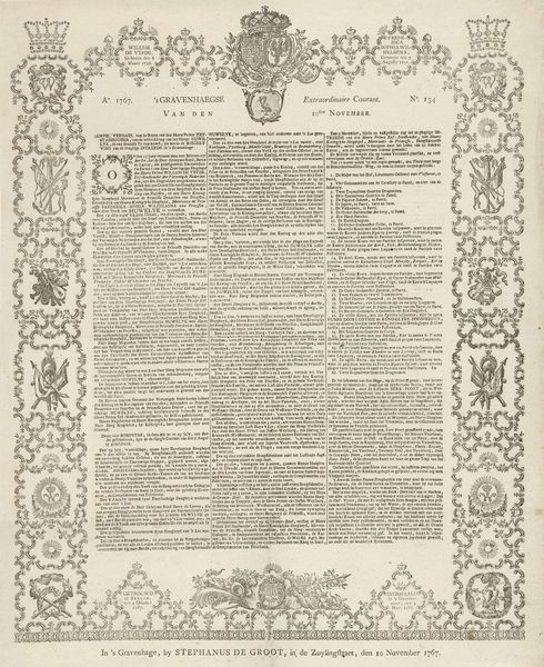
Dimensions: height 522 mm, width 408 mm
Copyright: Rijks Museum: Open Domain
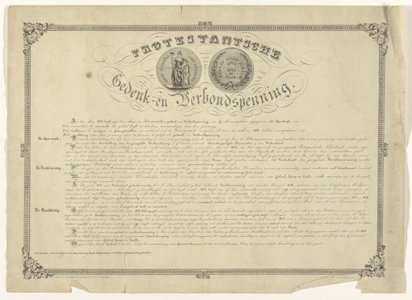
Curator: Just look at the level of detail in this piece. It’s an illustrated broadside titled "Vers bij het Alliantiefeest te Amsterdam, 1795," which roughly translates to "Verse for the Alliance Feast in Amsterdam, 1795." It's a fascinating mix of print, drawing, and typography on paper. The artwork dates back to 1795. Editor: My first impression? Overwhelming! There’s so much text crammed onto this page. It gives off a feeling of urgent political declaration… and, dare I say, a bit of visual chaos. Is it meant to be read, or admired first? Curator: Both, perhaps! It reflects the Neoclassical style of the time, with an emphasis on order and reason, even as it celebrates a period of upheaval and alliance. What might seem chaotic to us was, in its day, a carefully structured message for public consumption. Broadside were common for political movements to disseminate information. Editor: I see what you mean. The allegorical image at the top tries to bring order to the page, like a centerpiece trying to corral the commotion around it. It's all intertwined; the French and Batavian Republics becoming one, or so this artist is willing them to be. How much influence could a piece of graphic art such as this truly wield on a country’s geopolitical landscape? Curator: The French Republic heavily sponsored this unification between it and what is now the Netherlands. Consider the context. Amsterdam was in a celebratory fervor, a symbolic event marking a political alignment. This wasn't just information; it was carefully crafted propaganda to foster enthusiasm. Note the use of both French and Dutch here – the dual-language aspect emphasizes unification, even as the written test sings the praises of those very ideals. Editor: Right, so it is serving almost as a form of idealized press release. It wants to appear beautiful but exists to serve its own ends as well. Despite the overt nature of the text here, I can almost appreciate the hand-drawn border as a testament to an actual human putting in time and care. Curator: The artistry elevates the political message. A call to action disguised as, or perhaps enhanced by, artistic merit. Editor: A strange collision of propaganda, neoclassical order, and sincere hope for lasting peace… or at least the appearance of it. I feel I need to lay down after this broadside; my mind has been filled to the brim. Curator: It definitely is an intense piece. A reflection of a turbulent time captured in ink and paper, an era trying to believe in a better tomorrow.
Comments
No comments
Be the first to comment and join the conversation on the ultimate creative platform.
More like this