print, linocut
# print
#
linocut
#
abstract
#
linocut print
#
modernism
Copyright: Pierre Alechinsky,Fair Use
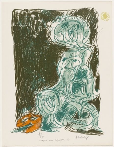
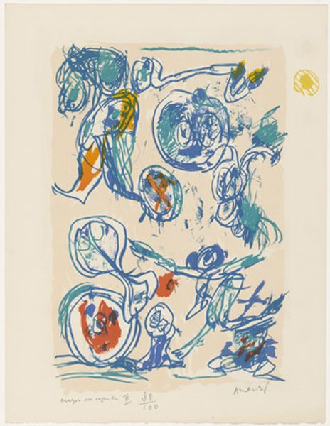
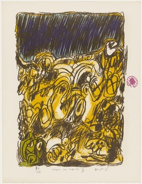
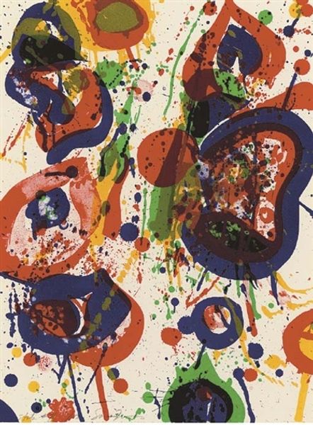
Editor: We’re looking at Pierre Alechinsky’s 1971 linocut print, "Waterzooi from the portfolio Pencil on Shell." There's something playful, almost comical about the swirling shapes and vibrant, scattered colours. How do you interpret this work? Curator: Playful is spot on, and almost childish, isn't it? The "Waterzooi" part of the title tickles me, as that’s a type of creamy, Belgian stew. I like to imagine him finding the familiar food in abstract form... see how Alechinsky uses linocut, with its bold lines and colour blocking, to evoke a sense of controlled chaos. A method of channelling energy! What's your take on the grey background, the ‘bowl’, containing the subject? Editor: I see what you mean about channeling energy. The 'bowl' does seem to keep all of this 'stew' together. But what do the colors mean in an abstract piece? Do they each have their place, or could it be any colour he felt like adding to the mix? Curator: Ha, the beauty of abstract art, isn’t it? The colors... they are the emotions that the stew may evoke, right? Maybe yellow for cheerfulness, or blue for a solemn calmness, who knows?! It makes the viewer decide what he sees in them! Ultimately it’s not about definitive meanings, but about the interplay of textures and sensations –the feeling it gives us! How do you react to it? Does the combination makes you hungry?! Editor: Hungry, not exactly, but I do like this artist's food. It makes a colourful statement! Thanks for illuminating that for me. Curator: My pleasure. I have a sudden craving for...well, something colourful! Let's get going.
Comments
No comments
Be the first to comment and join the conversation on the ultimate creative platform.
More like this