drawing, print, ink, pen, engraving
#
drawing
# print
#
11_renaissance
#
ink
#
pen
#
engraving
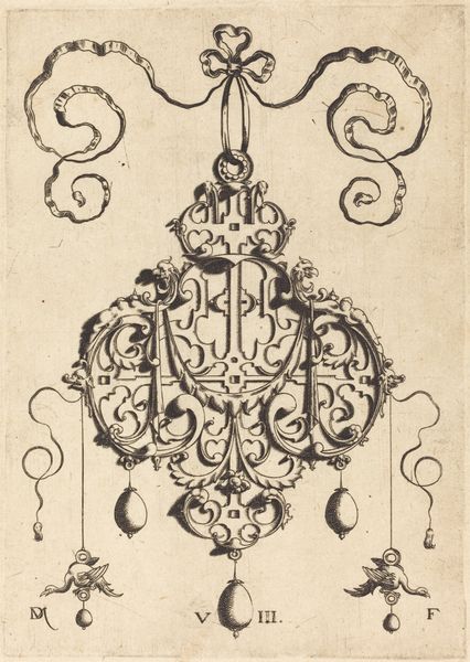
Dimensions: Plate: 5 5/16 x 3 11/16 in. (13.5 x 9.4 cm) Sheet: 5 7/16 x 3 13/16 in. (13.8 x 9.7 cm)
Copyright: Public Domain
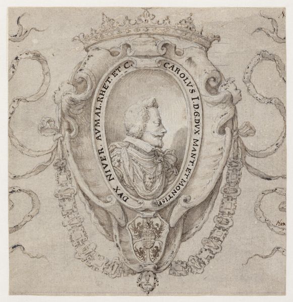
Curator: Look closely at Master P.R.K.’s “Design for a Pendant with the Alphabet” from 1609, currently residing at the Metropolitan Museum of Art. It's a remarkable drawing using pen, ink, and engraving. Editor: Wow, my initial impression is one of ornate whimsy, like a joyful celebration packed into a tiny heraldic shield! There's something so playful about the combination of formality and sheer fancifulness. Curator: Indeed! Formally, the composition utilizes an almost rigorous symmetry, anchoring itself on the central cartouche displaying the alphabet, framed by the artist’s initials. Note how the calligraphic precision is essential to its construction and legibility, typical of late Renaissance prints. Editor: Exactly, it's so orderly! But the elements surrounding it... they are delightful! You’ve got these little impish figures wielding miniature weapons and musical instruments! Then above the alphabet, that wild Bacchus figure on a barrel— it's quite surreal, a dance between order and pure imagination. The ribbon-like flourish ties it all together with panache. Curator: Precisely. Consider also the medium. The use of engraving, combined with pen and ink, allowed for a high level of detail and tonal variation, critical for communicating form and texture. See how the light reflects off of the surfaces in the drawing! These qualities enhance the ornament's potential as a functional design for an actual pendant. Editor: True. And those insects at the bottom—those are amazing! There's a real sense of close observation; it transforms what could be purely decorative into a window onto another world—all done with a quirky, artistic personality shining through. It feels timeless and surprisingly alive. Curator: So, to summarise our analysis: we’ve witnessed a design balancing function and ornamentation, order and imagination. The composition shows off calligraphic elements which are critical to the potential object and contribute towards making the final composition a success. Editor: For me, this little drawing, so stuffed with detail and spirit, tells you a story—you can dream your own story into it. What more could you want from a work of art?
Comments
No comments
Be the first to comment and join the conversation on the ultimate creative platform.
More like this