Copyright: Toko Shinoda,Fair Use
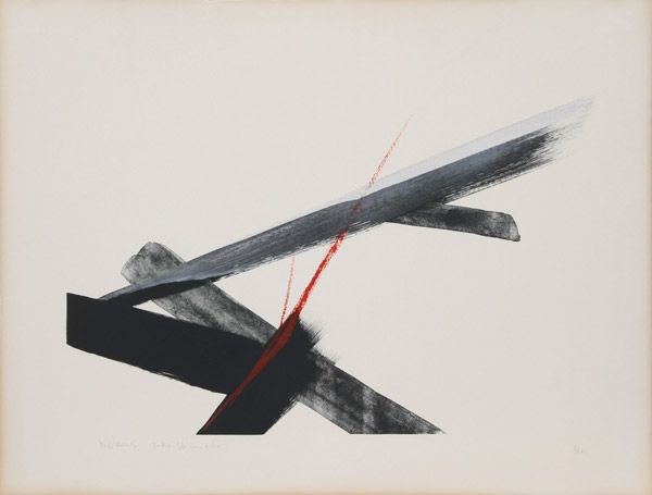
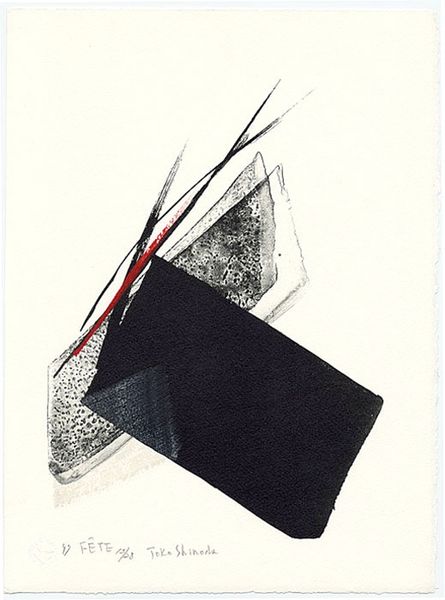
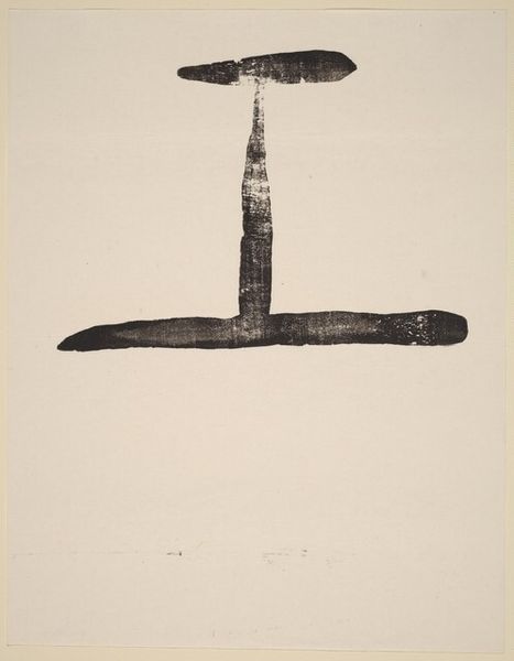
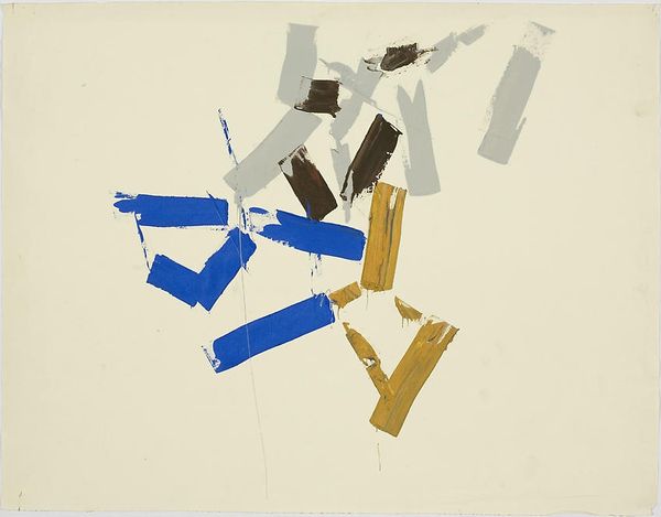
Editor: Here we have Toko Shinoda's "Reminiscence," created in 1984 using ink and graphite on paper. It feels so stark and minimalist. What do you see in this piece, considering its title? Curator: "Reminiscence," yes... The angularity almost belies the name. But look at the stark blacks contrasted with the soft grays and the single cool blue tone. These hues become a landscape of memory itself, fragmented and not entirely clear, wouldn’t you say? What feelings do those hard lines evoke in you? Editor: It feels… incomplete? Like a thought trailing off. It's there but fades away. Curator: Exactly. Now, consider Shinoda's blending of traditional calligraphy with modernist abstraction. Those strong strokes echo the visual language of Japanese calligraphy. Do you find these bold shapes and lines remind you of particular characters, perhaps? Editor: Now that you mention it, maybe some simplified kanji? Like echoes of script? It isn't direct, but feels symbolic. Curator: That's the dance of symbolism! And look closer still - doesn't that one faint blue shape feel like an attempt to resolve an irresolvable image? It suggests depth, something half-remembered just beyond the monochrome. Editor: Yes, I see it now. So the whole composition creates a tension, like trying to hold onto something fleeting. It really plays into that feeling of reminiscence. I initially didn't grasp those deeper meanings. Curator: Art invites revisiting. Symbols gain new resonance with each viewing, don't they? It is that continuous visual storytelling that is timeless and enduring. Editor: I will keep that in mind. Thanks.
Comments
No comments
Be the first to comment and join the conversation on the ultimate creative platform.
More like this