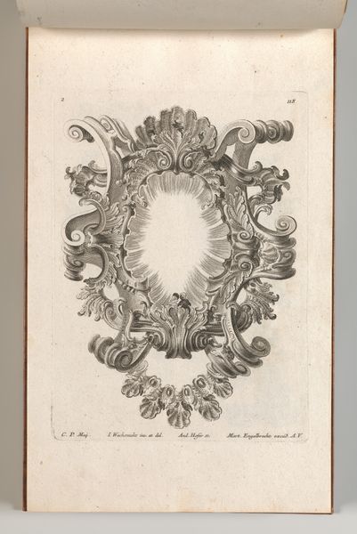
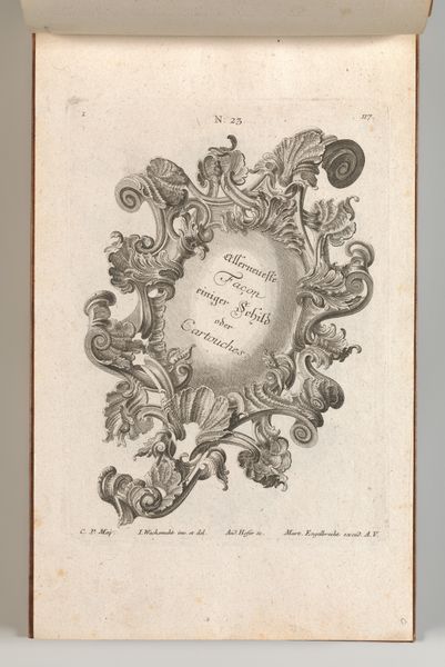
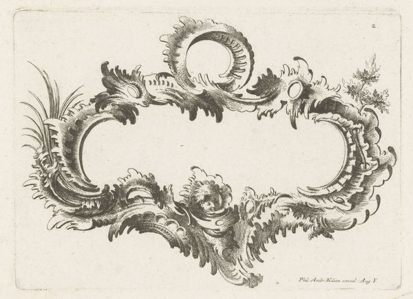
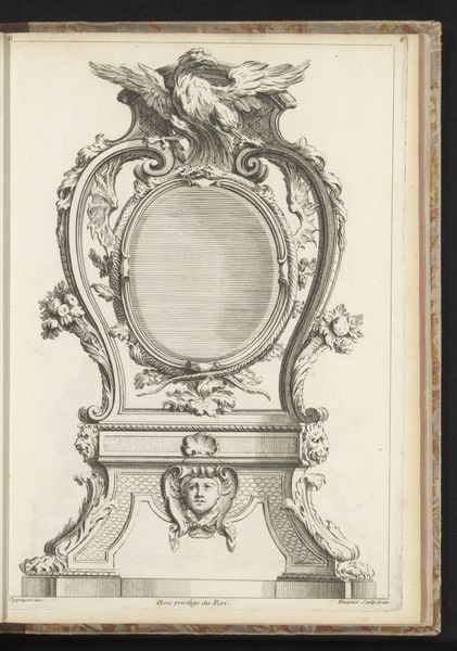
Design for a Cartouche, Plate 3 from 'Allerneueste Façon einiger Schild oder Cartouches' 1750 - 1756
0:00
0:00
drawing, print, etching, engraving
#
drawing
#
baroque
# print
#
etching
#
personal sketchbook
#
decorative-art
#
engraving
Dimensions: Overall: 8 7/16 × 13 3/4 in. (21.5 × 35 cm)
Copyright: Public Domain
Editor: So, here we have "Design for a Cartouche," plate 3 from 'Allerneueste Façon einiger Schild oder Cartouches,' created between 1750 and 1756 by Andreas Hofer. It's an engraving, etching, and drawing all in one! It's wonderfully ornate; so excessive, yet purposeful! What are your first thoughts when you look at it? Curator: Considering this design, I’m immediately struck by its function as more than just ornamentation. Cartouches in the mid-18th century weren’t simply decorative; they were embedded in a culture of display and power. This would likely be purposed for use as a symbol on buildings for nobility, maybe for furniture. Editor: So it's practical in function, as much as it is beautiful. Curator: Precisely. Ask yourself, who commissioned and consumed these kinds of designs? Understanding the patronage is key. Also, observe how Hofer uses line and form. This wasn’t mass-produced art; engravings like these signified wealth and access, reinforcing a social hierarchy. Editor: It's almost like visual propaganda, in a way? The elite showing off their status. Curator: That’s a strong point. In fact, the Baroque style itself, with its dynamism and flamboyance, was a tool for projecting authority. How does seeing it through this lens shift your understanding of its beauty? Editor: It makes me think about the labor that went into creating the drawing and how that labor contributed to reinforcing existing power structures. Curator: Exactly. By exploring this design through a historical and cultural lens, we realize its function extends far beyond pure aesthetics, offering insight into the society that produced it. Editor: That’s really changed my perspective. I’ll never look at Baroque ornamentation the same way again.
Comments
No comments
Be the first to comment and join the conversation on the ultimate creative platform.
More like this