engraving
#
baroque
#
history-painting
#
engraving
Dimensions: height 214 mm, width 148 mm
Copyright: Rijks Museum: Open Domain
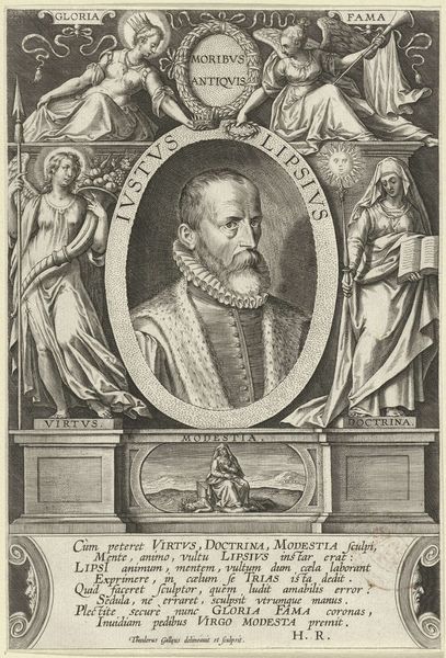
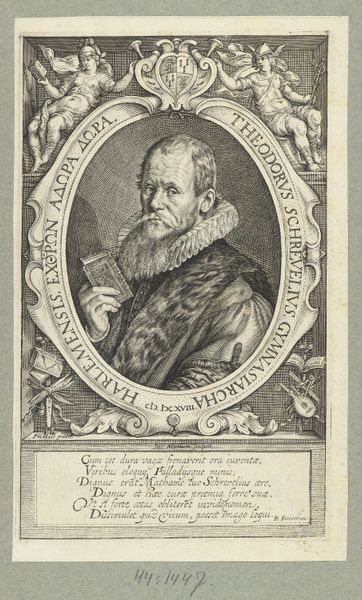
Editor: So, this is "Portret van Justus Lipsius," an engraving from 1613 by Jacques de Fornazeris, currently housed in the Rijksmuseum. It's quite detailed, even in this small format. I'm struck by how he's framed, almost like a classical hero, but with these... rather severe looking female figures on either side. How do you interpret this work? Curator: The framing is key, isn't it? Note how Lipsius is presented within this oval, referencing antique cameos or portrait medallions—placing him squarely in a humanist tradition, connecting him to classical virtues. The "severe looking female figures" as you call them are personifications of Gloria (Glory) and Fama (Fame), central to constructing a particular image of Lipsius. Why do you think those concepts were so important for his representation? Editor: I suppose it's about legacy? He wants to be remembered for his achievements. The figures look really autonomous as independent, almost sculptural forms on pedestals on which these concepts have been written, but also the text underneath has ‘Virtus’, ‘Doctrina’, and ‘Modestia’ mentioned… But are these visual cues persuasive? Do we accept that interpretation today? Curator: Exactly, it's about controlling his narrative, and dictating what elements of himself that should outlive his person. We have to ask, for whom was this image created, and what was its purpose? It circulated amongst intellectual elites. Knowing that helps us understand how he was trying to solidify his intellectual authority, by appropriating the visual language of power and associating himself with enduring ideals like ‘Virtus’, ‘Doctrina’ and ‘Modestia’, also concepts associated with womanhood. This could possibly give us an indication on the way he saw or wanted others to perceive women. Think about the gendered construction of fame, authority, and intellectualism present in this imagery. How might his identity intersect with the politics of the time? Editor: That's a really interesting point. Seeing it as an argument for authority, built with these carefully chosen symbols and presented to a very specific audience, really shifts my perspective. Thank you for pointing that out. Curator: It's in questioning those carefully constructed images that we find richer, more nuanced readings. I'm glad to have shed some light on this work.
Comments
No comments
Be the first to comment and join the conversation on the ultimate creative platform.
More like this