drawing, pencil
#
drawing
#
baroque
#
figuration
#
pencil
#
history-painting
#
academic-art
Dimensions: height 187 mm, width 221 mm
Copyright: Rijks Museum: Open Domain
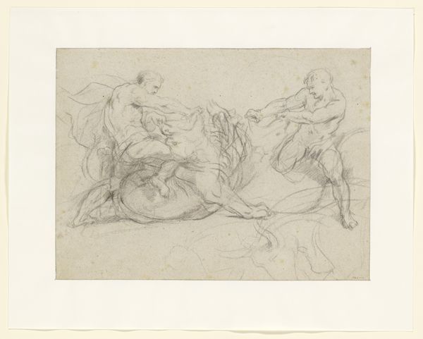
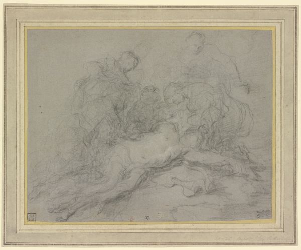
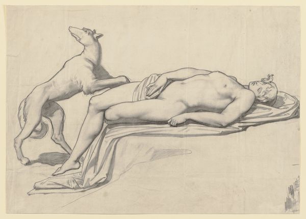
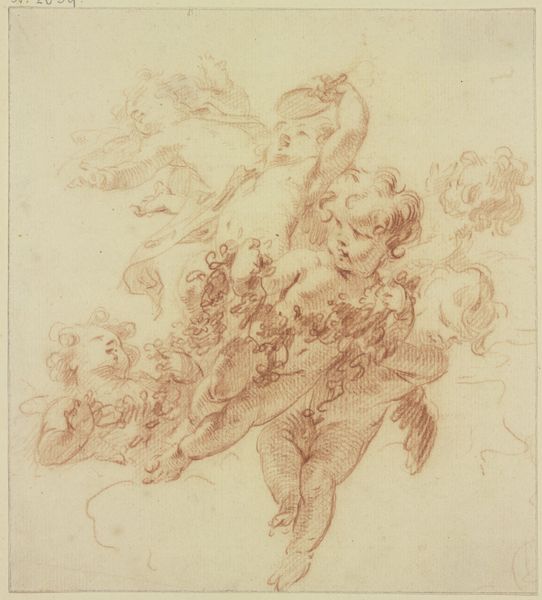
Editor: We are looking at Willem van Mieris’s, "Bewening van het lichaam van Christus," or "Lamentation of Christ’s Body," a pencil drawing dated between 1672 and 1747, housed in the Rijksmuseum. It’s incredibly moving, depicting Christ surrounded by mourners, yet feels distant and detached. What’s your take on it? Curator: Distant and detached... an interesting observation. I agree there's a certain… remoteness, isn't there? It lacks the raw emotion of some Baroque works. Perhaps Mieris was aiming for something more intellectual, a study in form and composition, see how the figures arrange around Christ almost like dancers? Or a poignant statement of sorrow from the safe distance of art? Have you looked into other academic artworks on religious topics? Editor: I see what you mean by "intellectual." It’s as if the emotion is filtered. There are figures, certainly reminiscent of classical statuary, but it feels... staged somehow? I have not, can you suggest some starting points? Curator: Staged, yes! Almost performative. Start by comparing this with similar drawings by, say, Annibale Carracci or even earlier, Raphael. Notice how Mieris borrows the tropes of academic art—the idealized bodies, the careful draping—but maybe doesn’t quite imbue it with the same soul, wouldn’t you agree? Or, perhaps, that restraint *is* the point? Grief observed, rather than felt? Editor: I do. It's a fascinating contrast. Studying the history and making these comparisons has changed my perspective. The emotion might not be overt, but it’s definitely there, subtle yet profound. Curator: Precisely! That whisper instead of a shout. See how a bit of art historical sleuthing can totally change your encounter with a piece? Always dig a bit deeper.
Comments
No comments
Be the first to comment and join the conversation on the ultimate creative platform.
More like this