About this artwork
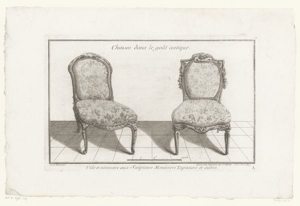
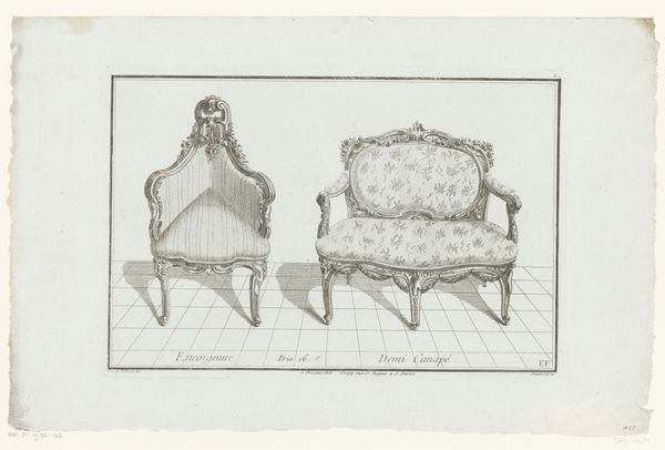
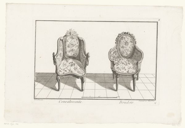
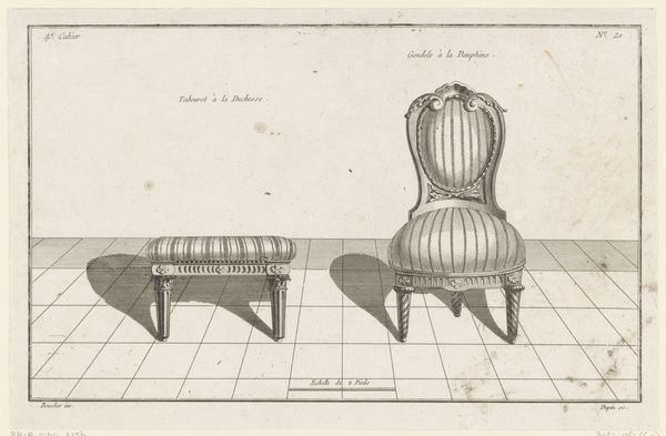
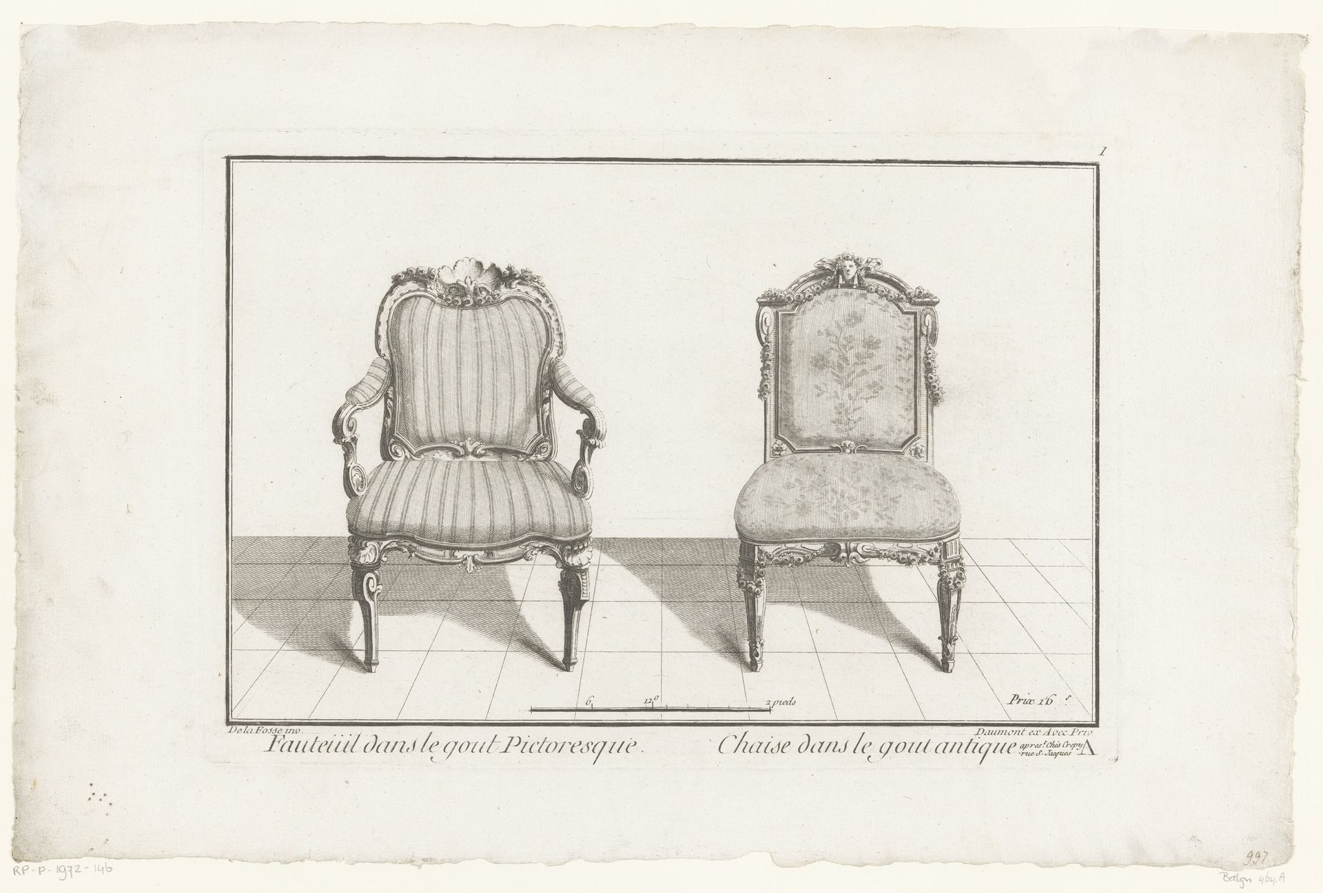
Curator: So, here we have an engraving, a print dating back to between 1753 and 1775, neatly titled "Twee stoelen", currently residing here at the Rijksmuseum. Anonymous, as the maker, depicts two chairs. What springs to mind for you, initially? Editor: Oh, the geometry! Such stark lines for representing something designed for comfort. The severe perspective contrasts so sharply with the florid, almost excessively ornamented chairs. Curator: Interesting. Ornamentation, in this period, really, it's communicating status, wealth. The Rococo style in the striped chair almost screams that, a sense of leisure. While its companion veers into Neoclassical tastes, evoking a somewhat "antique" feel as the caption notes, with more formal and sober motifs. Editor: Exactly, they're both such potent signifiers. Chairs are, in themselves, a subtle language of hierarchy and accessibility, but those details, it’s about sending deliberate messages: Who sits, where, and according to what aesthetic codes. I bet a lot of social maneuvering revolved around the presence and use of these specific chair types in rooms. Curator: Certainly. And this print could've served as a catalogue of sorts, a way for wealthy clients to select the most fashionable and appropriate seating for their homes. Do you notice how one is facing to the left and the other one to the right, it's the artist allowing you to perceive every part of both pieces. Editor: Ah! Visual merchandising of the 18th century. Each scroll and curve highlighted, and it’s presented in a starkly lit showcase... quite clever when you consider its intended practical uses. It almost empties it of that more human quality though. I find it more than a bit clinical and dry. Curator: Perhaps that adds to its appeal! It’s so concise, capturing the very essence of the forms. And remember, it’s a functional image that is a study about form with different and opposing design and styles. Each clean stroke a whisper of history frozen for our present gaze. Editor: Maybe that tension, between its practical function and stylistic expression is the secret to its quiet staying power then.
Artwork details
- Medium
- drawing, print, engraving
- Dimensions
- height 229 mm, width 332 mm
- Location
- Rijksmuseum
- Copyright
- Rijks Museum: Open Domain
Tags
drawing
neoclacissism
form
line
decorative-art
engraving
rococo
Comments
No comments
About this artwork
Curator: So, here we have an engraving, a print dating back to between 1753 and 1775, neatly titled "Twee stoelen", currently residing here at the Rijksmuseum. Anonymous, as the maker, depicts two chairs. What springs to mind for you, initially? Editor: Oh, the geometry! Such stark lines for representing something designed for comfort. The severe perspective contrasts so sharply with the florid, almost excessively ornamented chairs. Curator: Interesting. Ornamentation, in this period, really, it's communicating status, wealth. The Rococo style in the striped chair almost screams that, a sense of leisure. While its companion veers into Neoclassical tastes, evoking a somewhat "antique" feel as the caption notes, with more formal and sober motifs. Editor: Exactly, they're both such potent signifiers. Chairs are, in themselves, a subtle language of hierarchy and accessibility, but those details, it’s about sending deliberate messages: Who sits, where, and according to what aesthetic codes. I bet a lot of social maneuvering revolved around the presence and use of these specific chair types in rooms. Curator: Certainly. And this print could've served as a catalogue of sorts, a way for wealthy clients to select the most fashionable and appropriate seating for their homes. Do you notice how one is facing to the left and the other one to the right, it's the artist allowing you to perceive every part of both pieces. Editor: Ah! Visual merchandising of the 18th century. Each scroll and curve highlighted, and it’s presented in a starkly lit showcase... quite clever when you consider its intended practical uses. It almost empties it of that more human quality though. I find it more than a bit clinical and dry. Curator: Perhaps that adds to its appeal! It’s so concise, capturing the very essence of the forms. And remember, it’s a functional image that is a study about form with different and opposing design and styles. Each clean stroke a whisper of history frozen for our present gaze. Editor: Maybe that tension, between its practical function and stylistic expression is the secret to its quiet staying power then.
Comments
No comments