Copyright: Rijks Museum: Open Domain
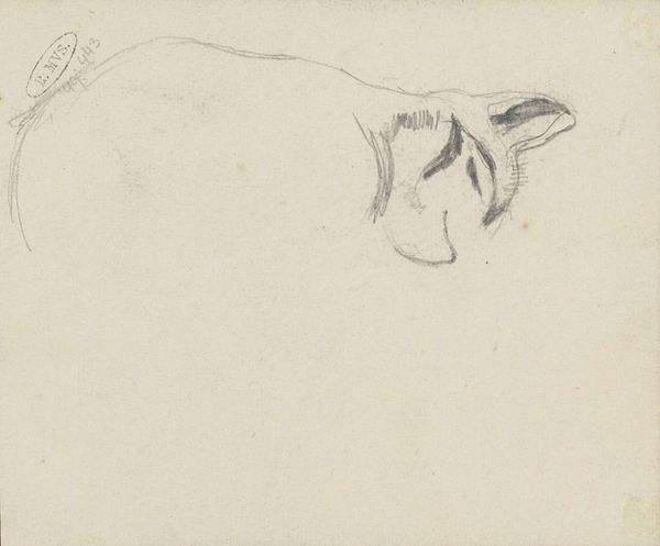
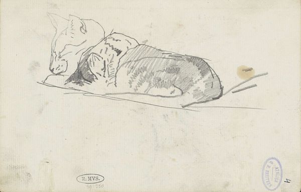
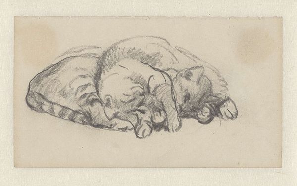
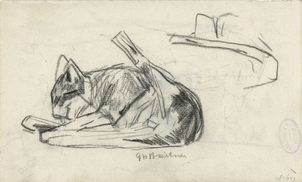
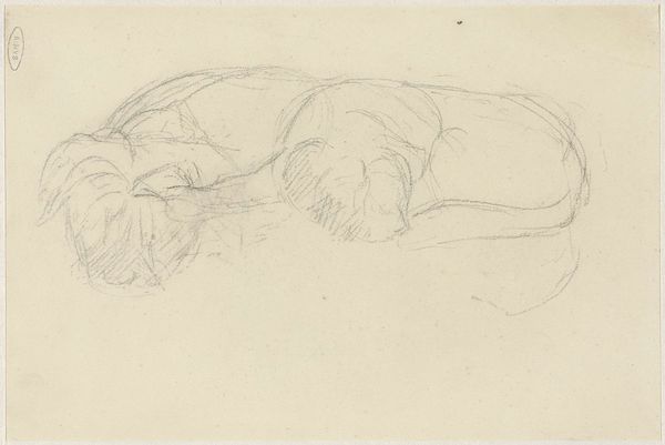
Editor: Here we have "Katten," or "Cat," a drawing by George Hendrik Breitner, likely created between 1885 and 1898. It feels very immediate, like a glimpse into the artist’s sketchbook. What catches your eye in this seemingly simple piece? Curator: Its simplicity, as you call it, is precisely where its formal strength resides. Observe how Breitner captures the essence of the cat with minimal strokes. The composition is dominated by the curvature of the feline’s back, a bold, continuous line that dictates the form. Do you see how that single line conveys weight, posture, and even character? Editor: Yes, I do! It's almost like a shorthand for 'cat-ness'. There's also a smaller, fainter sketch of the cat's tail underneath. What do you make of the use of the negative space surrounding the figure? Curator: The negative space is not merely empty; it defines the contours and amplifies the subject. By allowing the paper to breathe, Breitner directs the eye to the deliberate marks. The tail beneath serves as an echo, a reiteration of form, but lacks the assertive quality of the primary subject. Its ethereal quality emphasizes the importance of the more definite marks above. The juxtaposition adds dynamism, don't you agree? Editor: I see it now. So, beyond just being a quick sketch, the economy of line and careful use of space elevate the artwork. It makes me wonder how many studies he did to achieve such an efficient depiction. Curator: Indeed! This sketch becomes a testament to the power of suggestion. What starts as a casual observation is elevated through careful consideration of form and line into something meaningful and complete. Editor: I will never look at sketches the same way again. It shows that simplicity and efficiency in lines can be quite powerful.
Comments
No comments
Be the first to comment and join the conversation on the ultimate creative platform.
More like this