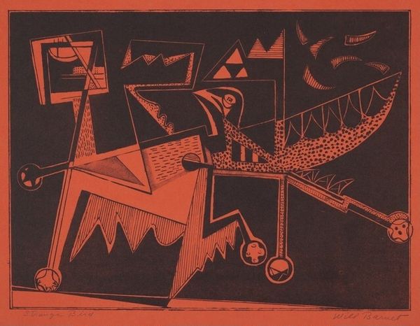
drawing, print, woodcut
#
drawing
# print
#
geometric
#
woodcut
#
abstraction
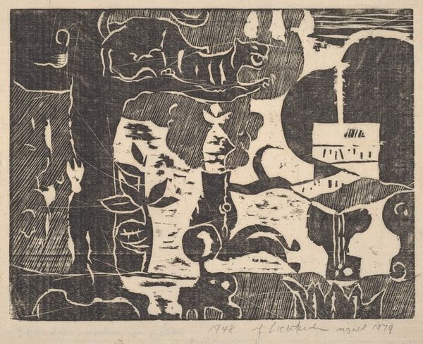
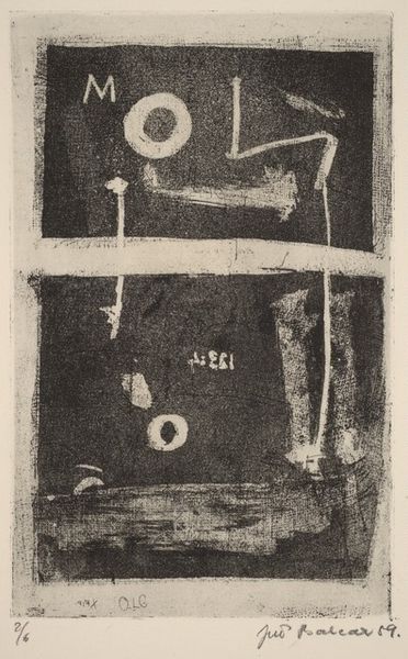
Dimensions: image: 28.6 x 59.1 cm (11 1/4 x 23 1/4 in.) sheet: 32.9 x 64.1 cm (12 15/16 x 25 1/4 in.)
Copyright: National Gallery of Art: CC0 1.0
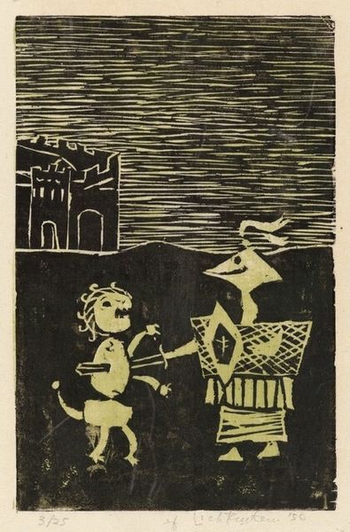
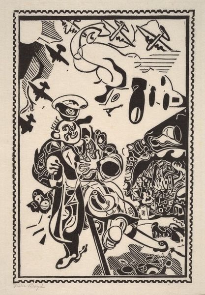
Curator: This composition has an arresting starkness to it. What is your initial reading? Editor: A bit medieval, perhaps? Or rather, a modernist take on the medieval. The rough texture and strong contrast remind me of block prints from the early 20th century, with that blue ink and raw paper quality so popular during the WPA era. Curator: It is indeed a woodcut from 1950 titled "To Battle," by Roy Lichtenstein, well before his iconic Pop Art appropriations. Lichtenstein was exploring different modes and manners early in his career. I feel like that history is so important here. Editor: Interesting—so the social context of the piece is really centered on its experimental nature as process, this "before they were famous" kind of origin story for Lichtenstein, the soon-to-be pop icon. Is this before his wholesale co-option of Ben-Day dots? Curator: Absolutely. This prefigures his interest in mechanical reproduction. Lichtenstein was grappling with geometric abstraction. We can look at these images as an attempt to visualize conflict or power dynamics with geometric forms. What readings can be interpreted by these shapes and how does the social commentary fit the period, the Cold War era? Editor: We see geometric shapes: hard lines, solid forms. These materials suggest not necessarily the means of a war being depicted, but the mood of war -- harshness and contrast in tone and line. It looks a lot less like actual fighting and more like set design to indicate "battle". Curator: I read these almost cartoonish images as abstracted combatants; and note their setting, against what appears to be a fortified structure. It brings up questions about the way in which masculinity, in particular, is constructed in war films and television of the era, too. Editor: Yes, like children's building blocks turned into tools of war. But that actually resonates with an artist looking at the production means to make sense of it. Even in abstracted forms, how can that be reshaped and reformed, or destroyed? It gives new insight to the material, even when reproduced through ink and wood. Curator: Precisely, the way "To Battle" offers a vital link in understanding Lichtenstein’s eventual turn to comic books, consumerism and popular imagery that are at the very center of his production means. The very meaning and message embedded in those visual sources. Editor: And as a means, this helps clarify the ways abstraction takes different forms beyond fine art – how "design" also signals ideas. Thanks for your take! Curator: You've brought new material light to a fascinating angle to that shift. Thank you!
Comments
No comments
Be the first to comment and join the conversation on the ultimate creative platform.
More like this