#
aged paper
#
homemade paper
#
script typography
#
sketch book
#
hand drawn type
#
personal sketchbook
#
hand-drawn typeface
#
column
#
thick font
#
sketchbook drawing
#
sketchbook art
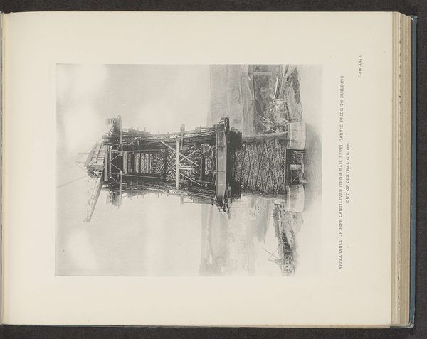
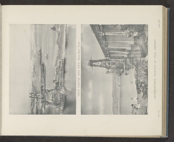
Dimensions: height 262 mm, width 200 mm
Copyright: Rijks Museum: Open Domain
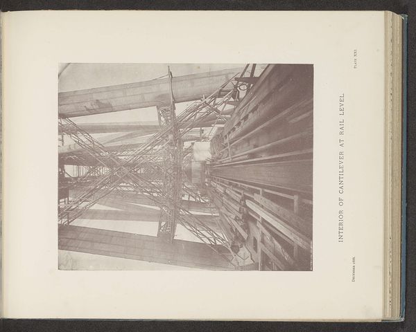
Editor: Here we have an image titled "Queensferry columns - looking through the bridge", created in 1887. It appears to be a sketch, possibly from a personal sketchbook. The sheer detail of the architectural rendering is fascinating, almost mesmerizing in its complexity. How do you interpret this work based on what you see? Curator: Note the intricate lattice structure that defines the depicted columns. Observe the way line is deployed; thin, precise strokes capture the vast industrial complex with surprising accuracy. The composition itself directs the eye upward, emphasizing the verticality and, indeed, the sheer scale of the engineering feat. Ask yourself, does the lack of color serve to flatten the image, bringing forward line and shape above all? Editor: That’s interesting. So, it's less about what the bridge *is* and more about how it's represented through these visual elements? The absence of colour almost abstracts it, yes? Curator: Precisely. Consider the interplay between the organic quality of the aged paper and the rigid geometry of the bridge's design. How does that juxtaposition contribute to the overall effect? One could even consider the script typography alongside the rendering, its forms subtly echoing that of the ironwork. Do you find harmony between these seemingly distinct modes of representation? Editor: I see what you mean! The lettering has a kind of structured elegance to it. Thanks; now when I look I see those shapes recurring throughout the composition! Curator: You're welcome. It highlights how a close look at composition and mark-making reveal new facets of meaning.
Comments
No comments
Be the first to comment and join the conversation on the ultimate creative platform.
More like this