Dimensions: image: 9.6 x 7 cm (3 3/4 x 2 3/4 in.) sheet: 19.9 x 13.9 cm (7 13/16 x 5 1/2 in.)
Copyright: National Gallery of Art: CC0 1.0
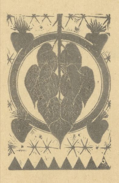
Curator: Welcome. Before us, we have a piece by Pam Georg Rueter, likely from 1953. It is titled "Letter 'R'", and presented as a linocut print. Editor: It’s a very striking image! I am immediately struck by its whimsical, slightly gothic character. It is an allegorical alphabet, ornate but also eerie, don’t you think? Curator: Indeed. The composition hinges on the central 'R,' stylized with floral elements and terminating in these peculiar, almost grotesque, shoe-clad feet. A face appears, formed ingeniously by a turnip with a leaf headdress! The visual syntax employs a symbolism common in decorative arts of that time. Editor: Right, but the material! Linocut is hardly the domain of high art—or is it? It's a process that favors bold forms and emphasizes the physicality of the carving and printing. And how do you interpret this particular employment of craft with subject, this allegorical figure formed out of what looks to be agricultural produce, like a beet? What is this commentary? Curator: I observe the artist employing a range of contrasting forms—the rigidity of the 'R' itself against the organic flow of the surrounding floral motifs. Furthermore, the turnip’s placement suggests a head or a crest, elevating a humble vegetable to a position of symbolic authority. It toys with perceptions of status and heraldry. Editor: Interesting observation about authority and heraldry; it suggests that Rueter may be speaking about the relationship of making art and food production, giving an equal footing to practices which could otherwise be understood through an aesthetic or utilitarian distinction. There’s also an undeniably handmade quality that brings attention to the labor. The unevenness, almost roughness, disrupts ideas of what an ornamental letter should or can be. Curator: The texture afforded by the linocut heightens that very contrast—the precise lines defining the letterform and the cruder cuts which shape the vegetation. These subtle tensions create dynamism, inviting multiple interpretations. The piece oscillates between playfulness and serious inquiry into the very nature of form. Editor: It underscores the beauty and potential hidden in both process and unassuming subject matter. It also provides insight into a creative ecosystem by positioning materials and processes from disparate economies in contact with one another. Curator: It serves, ultimately, as a playful yet profoundly insightful commentary on our relationship with not just letters, but form, status, labor, and meaning itself. Editor: Yes. A beautiful example of how something as modest as a linocut of a letter can unpack so many layered observations on material, labor, and symbol.
Comments
No comments
Be the first to comment and join the conversation on the ultimate creative platform.
More like this