Copyright: Public domain
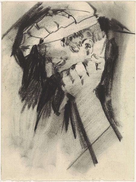
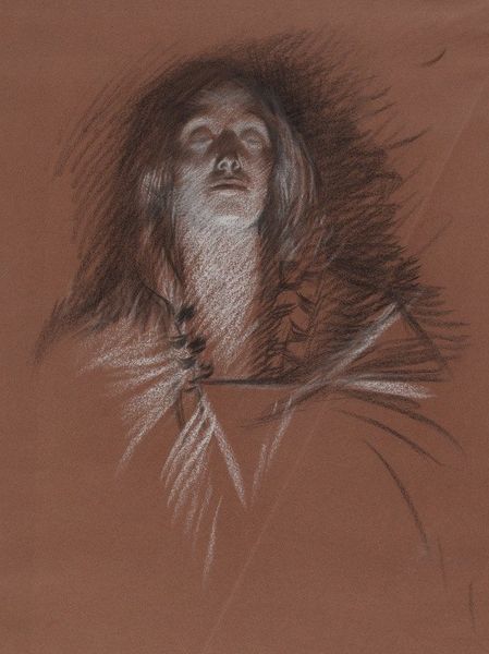
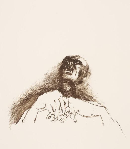
Editor: This is Käthe Kollwitz’s 1934 charcoal drawing, "Call of Death." Its stark use of light and shadow creates a very unsettling feeling. What visual elements stand out to you in this piece? Curator: Immediately, I'm drawn to the composition. Notice the stark contrast in values—the deep blacks against the negative space. This creates a palpable tension. Consider the direction of the strokes, the dynamism inherent in the charcoal marks. Do you observe how these marks guide the viewer’s eye? Editor: Yes, the marks create a strong directional pull that leads the eye right to the face, with those haunting, dark eyes. Curator: Precisely. Furthermore, observe the materiality of the work. The very texture of the charcoal, the way it sits on the page, contributes to the overall sense of unease. It's not merely representational, but actively expressive. What effect is created by that unfinished, ghostly hand hovering on the periphery? Editor: It makes the image more disturbing, as if death is a tangible presence intruding on this person's thoughts. The fact that it’s unfinished only heightens that sense of incompleteness, of life interrupted. Curator: An excellent point. Through the masterful manipulation of line, tone, and form, Kollwitz delivers not just an image of mortality but a deeply visceral encounter with its essence. So tell me, how has looking closely at these compositional choices shaped your understanding of the work? Editor: I initially responded emotionally, but analyzing the mark-making has made me realize just how carefully crafted that emotional response really is. Curator: Indeed. It underscores the power of formal elements to convey profound and unsettling themes.
Comments
No comments
Be the first to comment and join the conversation on the ultimate creative platform.
More like this