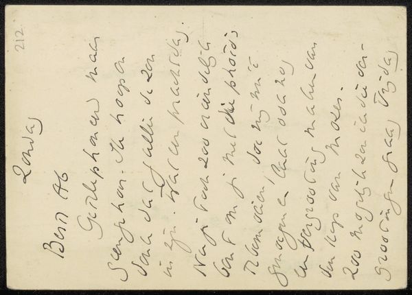
drawing, paper, ink
#
portrait
#
drawing
#
water colours
#
dutch-golden-age
#
paper
#
ink
Copyright: Rijks Museum: Open Domain
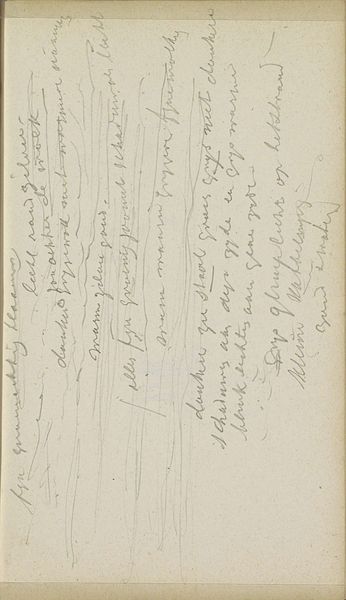
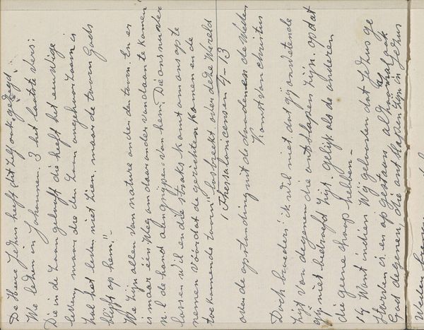
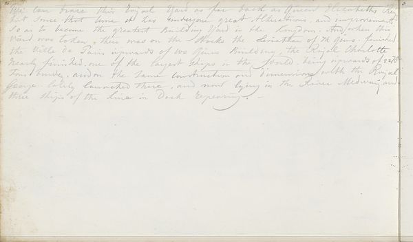
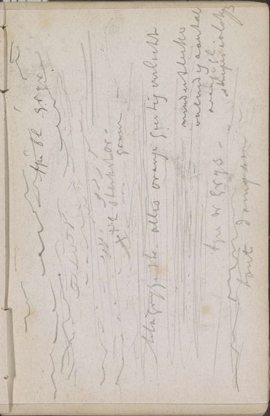
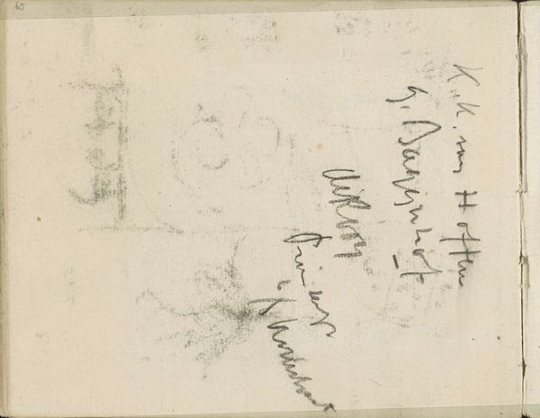
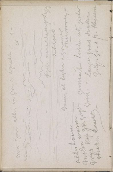
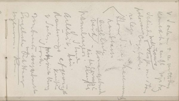
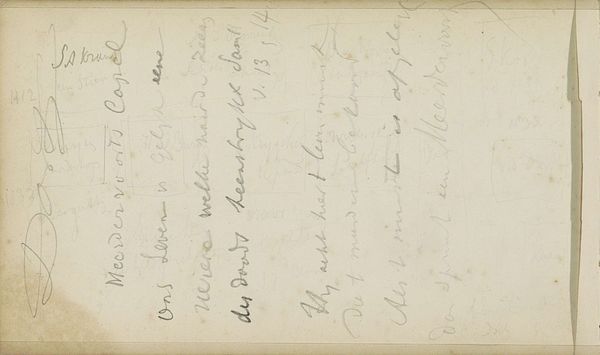
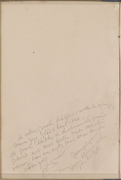
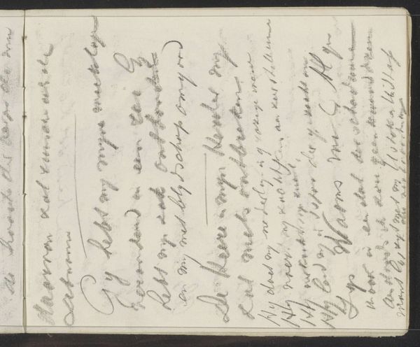
Editor: We're looking at "Notities" by Johannes Bosboom, dating from 1845 to 1891. It's a drawing done in ink and watercolour on paper. My first thought is about the way Bosboom has used such a light touch; the notes seem ephemeral, almost fading away. How do you interpret this work? Curator: From a formalist perspective, the composition draws me in. Observe how the page itself becomes a field for inscription, the palimpsest of ideas. The varying pressure of the ink, its differing line weights, generates a visual rhythm, does it not? Note, too, how the faint washes of watercolor—almost translucent—create spatial depth on an otherwise flat surface. Editor: Yes, the layering is subtle, but the overall impression feels unfinished, like we’re only getting a glimpse into the artist’s process. Curator: Precisely. The unfinished quality underscores the artwork’s essential nature as notation. One might argue that the true subject here is not what the notes say, but the act of noting itself – the physical and mental labor materialized in lines and hues. How does the non-linear arrangement of the writing affect your interpretation? Editor: I guess it breaks down any conventional reading, and suggests these thoughts were arriving randomly. The negative space then becomes equally important. Curator: Indeed. It allows the eye to freely move across the surface, connecting disparate elements. This, in turn, fosters a dynamic relationship between viewer and artwork—an active engagement rather than passive observation. The act of interpretation, in a sense, mirrors Bosboom’s creative process. Editor: It's fascinating how much can be gleaned from seemingly simple marks on paper. I see it completely differently now. Thanks! Curator: A rewarding endeavor to focus our attention on the intrinsic elements.
Comments
No comments
Be the first to comment and join the conversation on the ultimate creative platform.
More like this