drawing, paper, pen
#
drawing
#
incomplete sketchy
#
hand drawn type
#
etching
#
paper
#
personal sketchbook
#
linocut print
#
hand drawn
#
fading type
#
pen work
#
sketchbook drawing
#
pen
#
sketchbook art
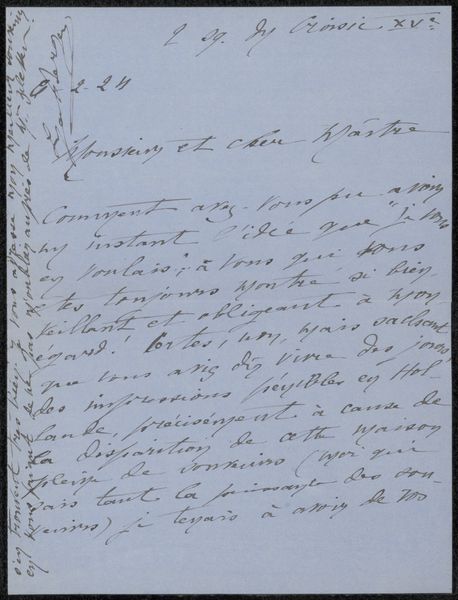
Copyright: Rijks Museum: Open Domain
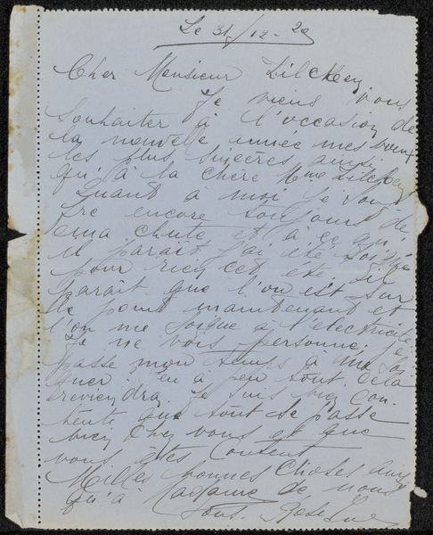
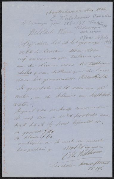
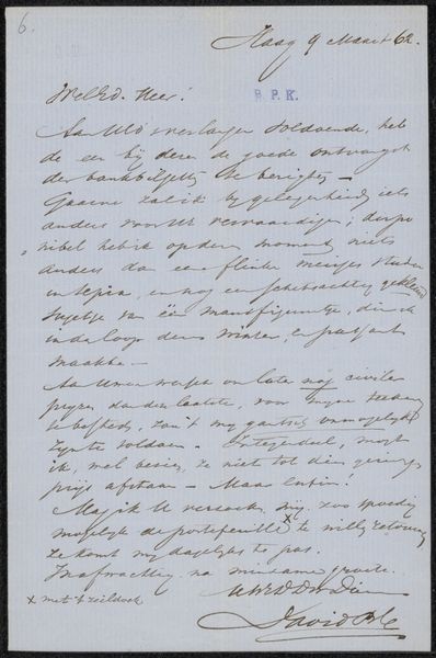
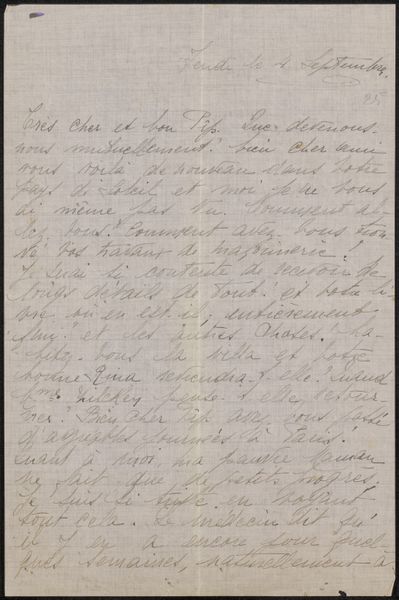
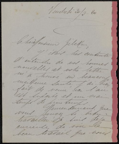
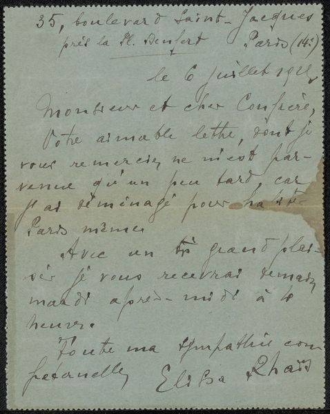
Editor: This is "Brief aan Philip Zilcken," potentially from 1919, done with pen on paper. The handwritten text gives it a really intimate feel, like you're looking at someone's personal sketchbook. It feels so ephemeral, as the written words are faded or sketchy. How do you interpret this work? Curator: This work presents an intriguing interplay between line, form, and surface. Note how the controlled yet spontaneous pen strokes create both legible script and abstract textural elements. It appears to privilege the act of writing not purely as communication, but as a performative gesture of mark-making, almost like an etching in its appearance. Editor: So, the way the words are drawn is more important than what they actually say? Curator: Precisely. The balance between legibility and abstraction invites contemplation on the material presence of language itself. Consider how the composition's visual weight is distributed and how that relates to your perception. Do you see any rhythm, and what principles of visual unity can be identified? Editor: I notice there's more text in the top-left, and my eye naturally follows the curve of the handwriting down to the signature on the lower right. It’s almost calligraphic in a way, and is as beautiful to behold, as to consider as a communication from someone to somebody else. Curator: The formal properties create a spatial tension and depth of engagement. It allows the personal sentiment to interact in a space that has been deliberately composed to become the thing itself. This moves it away from its documentary element as a 'letter' and towards it's objecthood. What strikes you most now about the work as an exercise in pure aesthetics? Editor: Now that I see it that way, I can see how the artist used the writing almost like a painter would use brushstrokes. Thanks, I never thought about analyzing text in that way before! Curator: By analyzing these components, we understand its intricate visual structures.
Comments
No comments
Be the first to comment and join the conversation on the ultimate creative platform.
More like this