drawing, pencil
drawing
dutch-golden-age
landscape
pencil
genre-painting
realism
Copyright: Rijks Museum: Open Domain
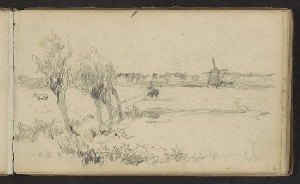
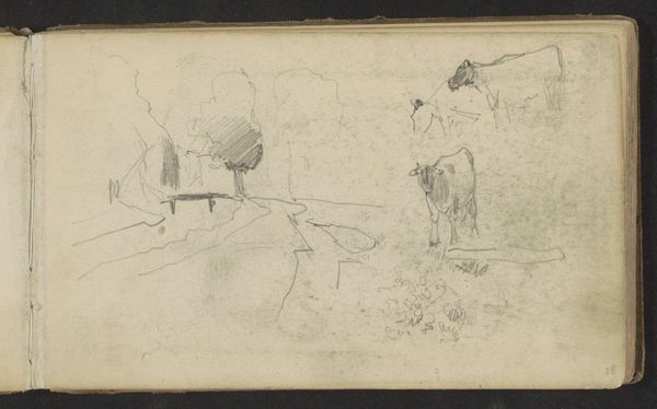
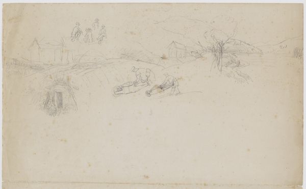
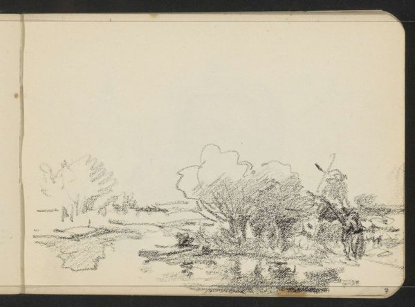
Editor: Right, next up we have a drawing from 1870 by Johannes Tavenraat. It’s called "Huizen bij een sloot, paarden en een koe bij een hek," which translates to something like "Houses by a ditch, horses and a cow by a fence". It’s a pencil drawing, very delicate and quite peaceful. What do you make of it? Curator: It's funny, isn't it? How a simple pencil sketch can evoke so much quietude. For me, it's the artist's restraint that truly captivates. He uses the bare minimum of lines to suggest a whole world, doesn't he? Makes you wonder what he saw, what made him pause to capture this particular scene. Does it make you feel like you were there at all? Editor: Definitely a sense of place! Maybe it's the rural subject, but there's something quintessentially Dutch about it. I was wondering about the different levels of detail. Why render some figures so faintly, while others are sharper? Curator: Ah, that’s where Tavenraat's cleverness lies. The contrast in detail creates a sense of depth and atmosphere, a visual hierarchy almost. The sharply defined horse grounds us, pulls us into the foreground. The other elements become part of the landscape, almost dreamlike... perhaps the artist was testing to see what elements to include, trying to see what "stuck". What do you think the lighter elements bring to the whole picture? Editor: That makes sense! The lighter elements make it feel more expansive. So, he is establishing space through tonal variation? I guess it is like the horse and cow is here with us, in the immediate world. Curator: Exactly. Almost like he’s saying: here is what truly matters. Isn't it strange how the simpler an artwork seems, the more layers you find within it? Editor: Definitely! This one really sneaks up on you. I find I am now really taken with how evocative something so unassuming can be.
Comments
No comments
Be the first to comment and join the conversation on the ultimate creative platform.