drawing, collage, lithograph, print, paper, ink
#
drawing
#
collage
#
lithograph
# print
#
caricature
#
figuration
#
paper
#
ink
#
line
#
genre-painting
#
watercolor
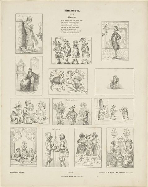
Dimensions: height 442 mm, width 350 mm
Copyright: Rijks Museum: Open Domain
Curator: So, we're looking at "Kaartspel. / Nr. 4. / Klaveren," which translates to "Card Game. / No. 4 / Clubs," a collage of lithograph, ink, and watercolor, likely from somewhere between 1843 and 1920, created by J. Beeg. It has the most whimsical, genre-painting scenes embedded in the club motif. Editor: Initially, I’m struck by the rather subdued, almost melancholic quality despite its playful caricatures and use of vibrant color. It has the same disquieting, sardonic quality of someone in the throes of nervous laughter. Curator: Well, I find that interesting. Formally, each figural tableau has an elegance, with a very careful attention to detail. Do you observe how the artist, while adopting caricatures, has organized all of these scenes into a visually arresting composition, using the club card shape as a compositional base for narrative snippets? It's organized, and it directs your eye carefully. Editor: Absolutely, the clubs structure functions as a sort of window or a stage for each of these little dramas, emphasizing the constructed, theatrical nature of these scenes. I see the overarching subject matter is a commentary on class and society? I notice that figures with darker skin tones recur throughout and may embody satirical commentary? It reminds me how entrenched many stereotypes were throughout 19th-century visual culture. Curator: I do wonder about the role and depiction of minorities, here. However, I cannot ignore the stylistic and compositional strength inherent in the overall collage format. It is almost a storyboard. As well, note the thin yet distinct, descriptive linework in each print, which does give an otherwise ridiculous tableau a dignified feel. Editor: You’re right; Beeg's lines carry a confidence, a sense of assuredness that paradoxically reinforces both the charm and unease that define the whole aesthetic. In the end, one appreciates the layered textures: watercolor meeting lithograph meeting ink… an exciting mixture to reflect upon further. Curator: I couldn't agree more. There’s always something more to observe in art when its forms and styles mingle as vividly as this piece.
Comments
No comments
Be the first to comment and join the conversation on the ultimate creative platform.
More like this