#
aged paper
#
homemade paper
#
paper non-digital material
#
pale palette
#
pastel soft colours
#
paperlike
#
light coloured
#
personal journal design
#
paper medium
#
design on paper
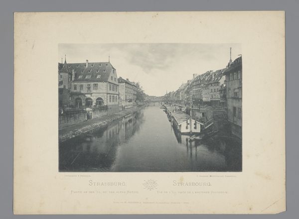
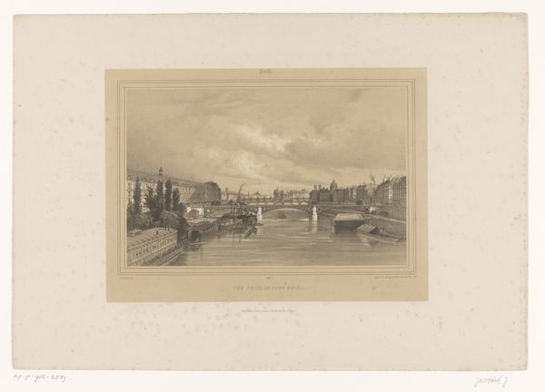
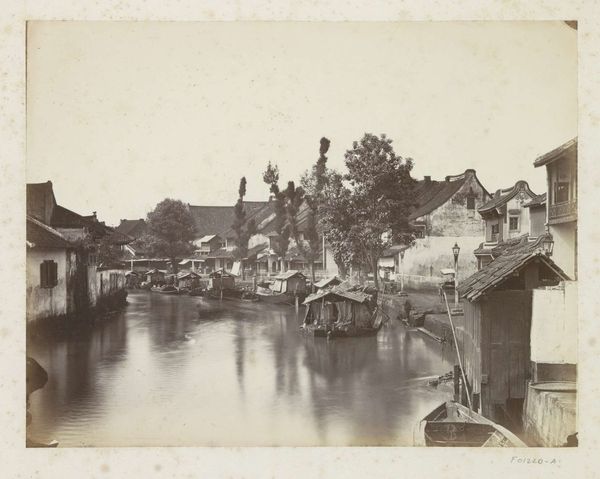
Dimensions: height 153 mm, width 217 mm
Copyright: Rijks Museum: Open Domain
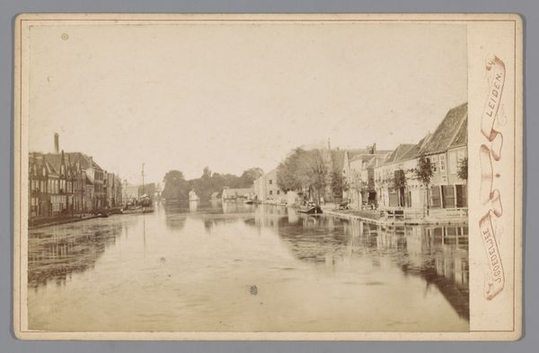
Editor: This is a photograph titled "Gezicht op Straatsburg met de Ill," created before 1894 by Charles Bernhoeft. It's a vintage print on paper, and it strikes me as very peaceful, almost like a memory fading into time. What do you see in this piece? Curator: Initially, one observes the meticulous arrangement of tonal values. Notice the composition, particularly how the receding perspective draws the eye along the river Ill. The contrast between the solid forms of the buildings and the reflected light on the water creates a visually interesting interplay. Editor: The reflections are quite striking, now that you mention it. Does the materiality of the paper contribute to the overall impact? Curator: Indubitably. The texture of the aged paper, likely a deliberate choice by the artist, enhances the photograph's visual depth. It softens the overall image, imparting a nostalgic quality that aligns perfectly with the subject matter, doesn’t it? Editor: I hadn't considered the impact of the paper itself so deeply. So, by focusing on these aspects - composition, tone, and the materials - we can uncover deeper meaning in a photograph like this, without relying on historical context? Curator: Precisely. While historical context certainly enriches our understanding, a formalist approach prioritizes the artwork’s inherent visual language. Analyzing these elements reveals the photograph's intrinsic qualities and its aesthetic impact. Editor: I see, focusing on how the formal elements communicate meaning. Thank you, I learned so much looking at this with you. Curator: You are most welcome. The true value lies in fostering a more critical understanding of art through considered observations.
Comments
No comments
Be the first to comment and join the conversation on the ultimate creative platform.
More like this