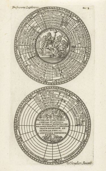
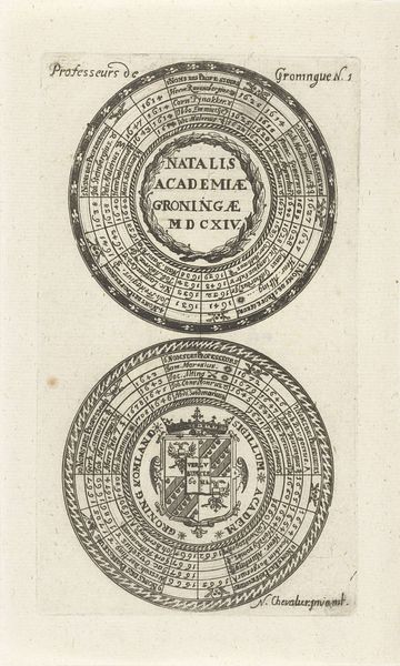
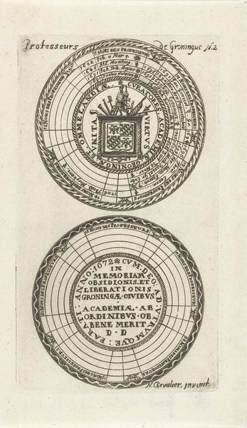
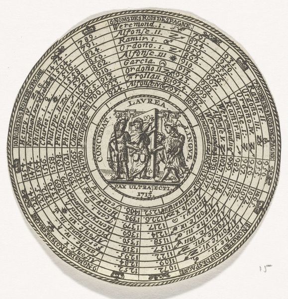
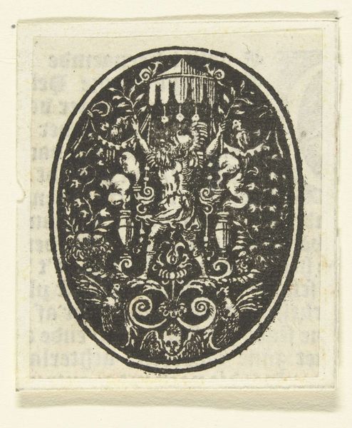
Zegels van de Universiteit van Leiden, met namen van de hoogleraren en het wapen van de universiteit 1685 - 1720
0:00
0:00
drawing, graphic-art, print, ink, engraving
#
drawing
#
graphic-art
#
baroque
#
pen drawing
# print
#
ink
#
geometric
#
line
#
academic-art
#
engraving
Dimensions: height 148 mm, width 80 mm
Copyright: Rijks Museum: Open Domain
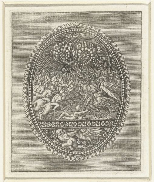
Editor: Here we have "Seals of the University of Leiden, with names of the professors and the coat of arms of the university," dating from 1685 to 1720, rendered in ink using engraving techniques. The tight, circular composition makes my eyes dart around the piece. How do you interpret this work formally? Curator: Intriguing. Let us focus on the intrinsic properties. The circular forms immediately establish a sense of unity, yet the division into two distinct circles creates a dialogue. The upper circle's central figure stands erect, while the lower circle presents a heraldic lion. Note the dense inscription encircling each image. Do you see how the text functions not just as content, but as a visual element, a textural ring? Editor: Yes, the lettering creates a very strong sense of pattern. Almost like the bands on a tree trunk showing its age. But why circles? Curator: Circles are recurring motifs in art, aren't they? We are trained to consider formal elements without immediate references to symbolic associations. Here, the circles suggest completeness, an enclosure, or perhaps a visual echo of seals, reiterating the artwork’s own content. How does the line quality contribute to your understanding? Editor: The lines are so fine and precise, which must have taken immense skill, especially in those tight curves. It creates a sense of formality and precision. Is that purely aesthetic, or could it have been intentional? Curator: Form and intention are intertwined. Consider the medium of engraving. Each line is deliberate, immutable. The artist's control is evident in every mark. I find that detail far more relevant than the nominal context. Does analysing it like this influence how you see it now? Editor: Definitely. Seeing the geometric structure, and appreciating the density of line, shifts it away from just an historical document and towards an artwork. I'm thinking much more about technique than meaning. Curator: Precisely. The aesthetic decisions become as central as the historical content. We see this Baroque piece with fresh eyes now, perhaps? Editor: I've certainly learned to consider artwork from a formalist view and it provides an interesting, if less historical context, than I expected.
Comments
No comments
Be the first to comment and join the conversation on the ultimate creative platform.
More like this