Dimensions: 25.5 x 25.5 cm
Copyright: Public domain
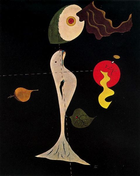
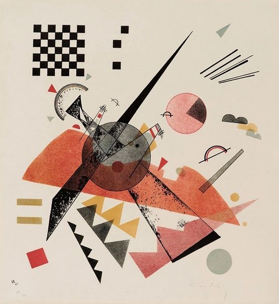
Curator: Wassily Kandinsky’s watercolor from 1921, titled "Study for Circles on Black," presents us with a captivating dance of geometric shapes and chromatic tension. Editor: It feels… anxious, almost urgent. The darkness looming behind these vibrant shapes gives everything a slightly desperate, flickering quality, like it's trying to ward off something. Curator: Indeed. The abstract expressionist and modernist styles he embodies here echo prevailing anxieties of his era through symbolism—geometric shapes evoke mathematical certainty, circles can represent harmony and cosmos, yet everything occurs within a turbulent, unknowable background. Editor: And the individual elements themselves… the colors aren't quite blending, everything has a very definite border. Almost feels confrontational; each piece asserting itself. And those strange, almost cellular shapes hovering above? They add a distinctly biomorphic touch. Curator: Those forms are characteristic of Kandinsky's belief that art should convey spiritual and emotional truths, which he accomplishes through the specific manipulation of forms and color relationships. The symbolism and interplay serve as an analogy to interior psychological and spiritual states. He seeks emotional responses to pure form rather than recognizable content. Editor: Right, right... pure feeling. Even though these are studies, it all feels meticulously arranged, the antithesis of random splattering, doesn't it? Is there any indication the artist saw musical correlations when developing the final composition? I almost want to "hear" what's going on in that picture. Curator: That is exactly Kandinsky’s intention. He strove for synesthesia, aligning color and form with musical tonalities to elicit emotional and even spiritual awakening. "Color is the keyboard, the eyes are the hammers, the soul is the piano with many strings," as he puts it in his Concerning the Spiritual in Art. Editor: What a cool line, almost worth hanging in the place of a sign for patrons entering this exhibit. Overall, I must say that in comparison to his works that use stronger, simpler color schemes, I still come away a bit unsure as to where to place Kandinsky. This piece certainly does not soothe. Curator: Its disquiet comes from Kandinsky’s personal search and our shared one—his shapes remind us of striving for definition while embracing that mystery of being. It makes this artwork less about an era, and perhaps more, about us.
Comments
No comments
Be the first to comment and join the conversation on the ultimate creative platform.