#
st-ives-school
Copyright: Terry Frost,Fair Use
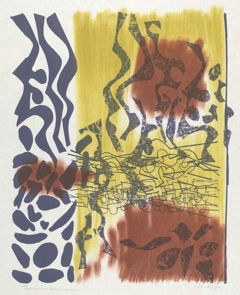
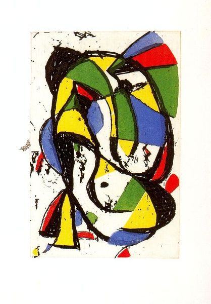
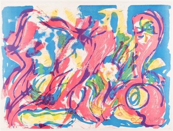
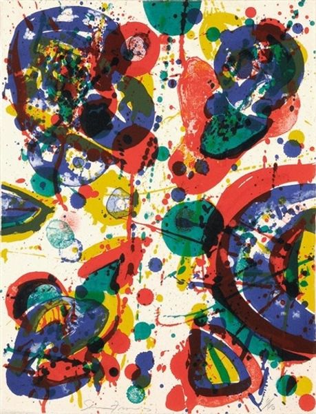
Terry Frost made this print, called Variations, using screenprinting which is all about layering colours to build up an image. He's using flat bold colours and simple shapes, kind of like he's playing with building blocks. The colours, red, yellow, and blue, sit together with black. Look at how the blue waves seem to move with a playful energy, and the shapes above feel like little characters peeking out. The texture is mostly smooth, but in places you can see the slight graininess of the printing process, which is a reminder of the hand-made process involved. I really like the way the blue paint looks almost watery, even though it's just flat colour on paper. The brushstrokes create this sense of movement, of a thing that flows. Frost reminds me of Matisse in his love for colour, but he's got a rougher edge. Both artists embrace ambiguity, inviting us to find our own stories in their works.
Comments
No comments
Be the first to comment and join the conversation on the ultimate creative platform.
More like this