About this artwork
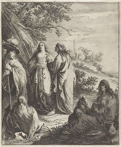
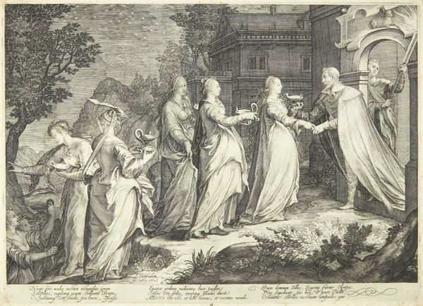
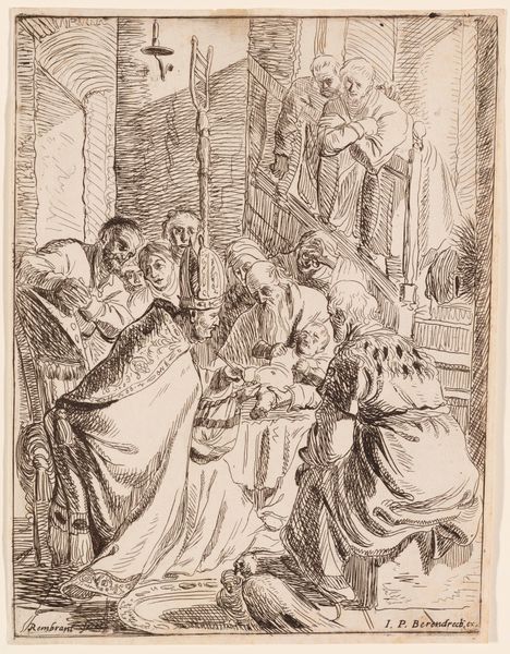
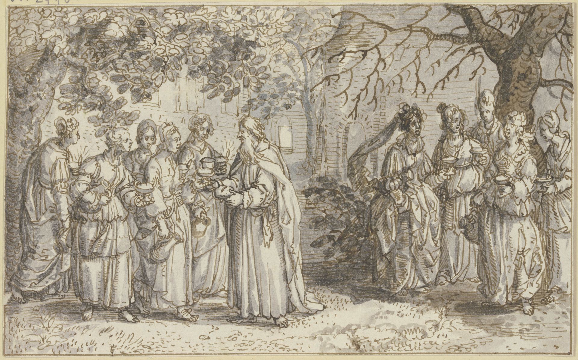
Editor: Here we have "The Wise and Foolish Virgins" by David Vinckboons, circa 1611, rendered in ink on paper. The monochrome tones create a rather somber, almost ethereal atmosphere. What jumps out at you when you look at this drawing? Curator: Immediately, the distribution of light and dark across the picture plane commands attention. Note the artist's deployment of wash to differentiate the two groups of figures. The compositional balance hinges upon this contrast, wouldn’t you agree? Editor: I do. The groups are almost mirror images of each other in placement, yet tonally very distinct. Can you expand on that distribution? Curator: Precisely. Consider how Vinckboons utilizes line and shading to define form and texture. The robes of the figures, for instance, are articulated with varying degrees of intensity. The skillful employment of cross-hatching builds volume, creating the illusion of depth within the picture space. Where does the artist lead the eye next? Editor: Perhaps toward the architecture in the background and then back into the two clusters of figures. What do you make of how Vinckboons used negative space around them? Curator: It appears designed to separate these key actors. Furthermore, the arrangement directs one's focus back onto the figures themselves and encourages meticulous scrutiny of the rendering. Editor: The visual balance achieves a rather profound impact through fairly limited means. Curator: Precisely. By reducing visual complexity, Vinckboons guides us toward its structural elegance.
Die Klugen und die Törichten Jungfrauen
c. 1611
Artwork details
- Medium
- drawing, paper, ink
- Location
- Städel Museum
- Copyright
- Public Domain
Tags
Comments
Share your thoughts
About this artwork
Editor: Here we have "The Wise and Foolish Virgins" by David Vinckboons, circa 1611, rendered in ink on paper. The monochrome tones create a rather somber, almost ethereal atmosphere. What jumps out at you when you look at this drawing? Curator: Immediately, the distribution of light and dark across the picture plane commands attention. Note the artist's deployment of wash to differentiate the two groups of figures. The compositional balance hinges upon this contrast, wouldn’t you agree? Editor: I do. The groups are almost mirror images of each other in placement, yet tonally very distinct. Can you expand on that distribution? Curator: Precisely. Consider how Vinckboons utilizes line and shading to define form and texture. The robes of the figures, for instance, are articulated with varying degrees of intensity. The skillful employment of cross-hatching builds volume, creating the illusion of depth within the picture space. Where does the artist lead the eye next? Editor: Perhaps toward the architecture in the background and then back into the two clusters of figures. What do you make of how Vinckboons used negative space around them? Curator: It appears designed to separate these key actors. Furthermore, the arrangement directs one's focus back onto the figures themselves and encourages meticulous scrutiny of the rendering. Editor: The visual balance achieves a rather profound impact through fairly limited means. Curator: Precisely. By reducing visual complexity, Vinckboons guides us toward its structural elegance.
Comments
Share your thoughts