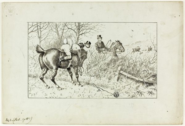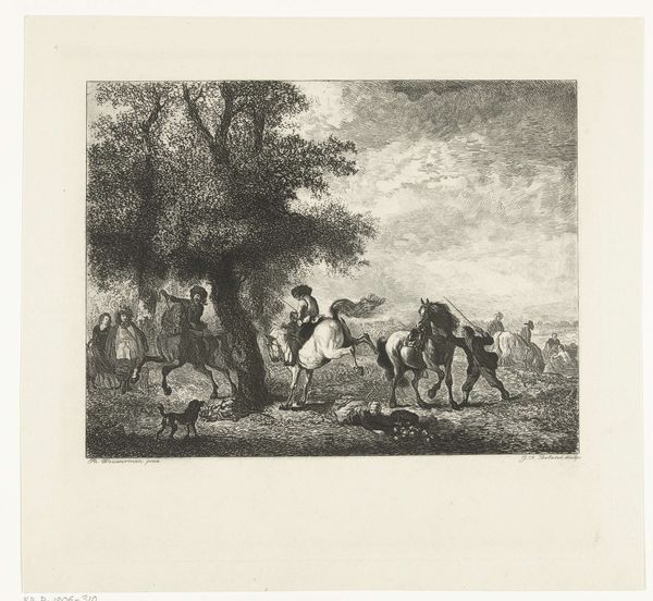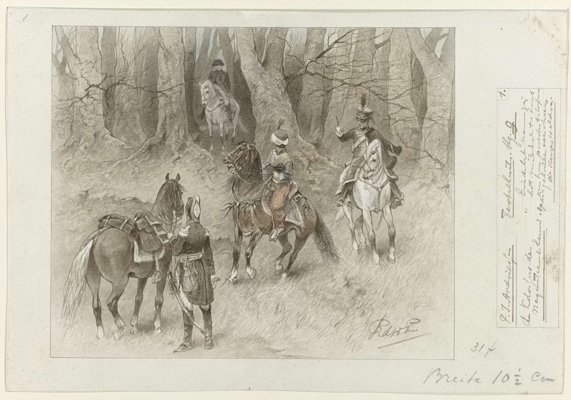
1877 - 1942
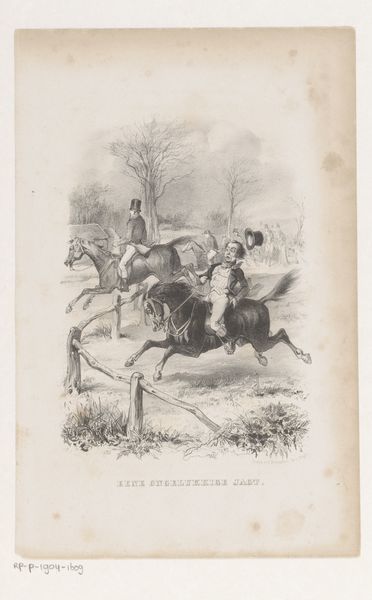
Ontwerp voor illustratie voor De Kolossus der Negentiende Eeuw door P.J. Andriessen (Textill., blz. 9); scène uit het leven van Napoleon
Listen to curator's interpretation
Curatorial notes
Curator: This is a pencil drawing by George Lodewijk de Wetstein Pfister titled "Ontwerp voor illustratie voor De Kolossus der Negentiende Eeuw door P.J. Andriessen; sc\u00e8ne uit het leven van Napoleon." It dates to between 1877 and 1942. Editor: It feels ominous, doesn’t it? The muted tones, the shadowy forest… a very pensive Napoleon, removed from any glorification. The horses and riders seem to melt into the environment itself. Curator: Indeed. The romantic landscape certainly contributes to that feeling, with its emphasis on emotional intensity. Consider the way the artist uses line and shading to create depth. See how the texture of the trees becomes almost tangible. It demonstrates the academic precision in representing the natural world, yet simultaneously evoking an emotional atmosphere. Editor: Absolutely. One can see Napoleon’s rise through the framework of 19th century political upheaval, painted in tones that reject outright glorification. Is this piece meant as a cautionary tale about imperial hubris, cloaked in the popular appeal of romantic landscape painting? The surrounding text on the document suggests that the picture depicts something "terribly wrong". Curator: A valid question. The work also echoes academic artistic conventions and the way historical painting traditionally elevated its subject. You see elements of classical composition merged with the starker, realist detail that would become fashionable with artists of the time. Notice the interplay of light and shadow on the horses and riders, adding drama. Editor: Yes, that push-pull. Are we meant to admire or critique? This work reveals its story and conceals it at the same time. What does the absence of strong colors represent here? A fading glory? Or a statement of quiet protest? It begs the viewer to consider power, legacy, and narrative framing. Curator: Looking at it formally, there’s certainly that inherent tension within the very structure of the artwork. I appreciate how a simple, almost understated technique delivers such complexity and emotional depth. Editor: Agreed. It is more than a sketch; it invites a broader investigation into the historical, social, and ethical considerations of empire.