print, woodcut, engraving
# print
#
landscape
#
figuration
#
romanticism
#
woodcut
#
line
#
history-painting
#
engraving
Dimensions: 316 mm (height) x 188 mm (width) (bladmaal)
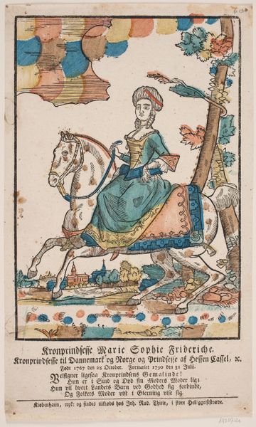
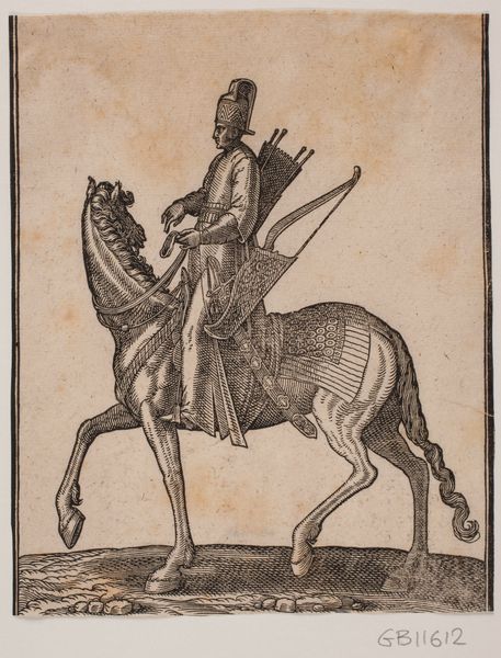
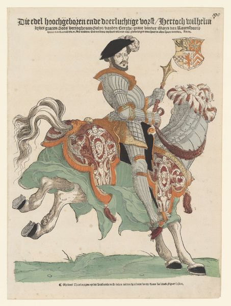
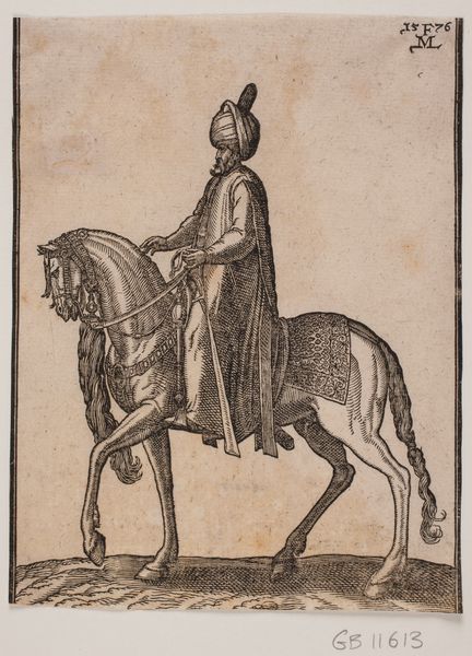
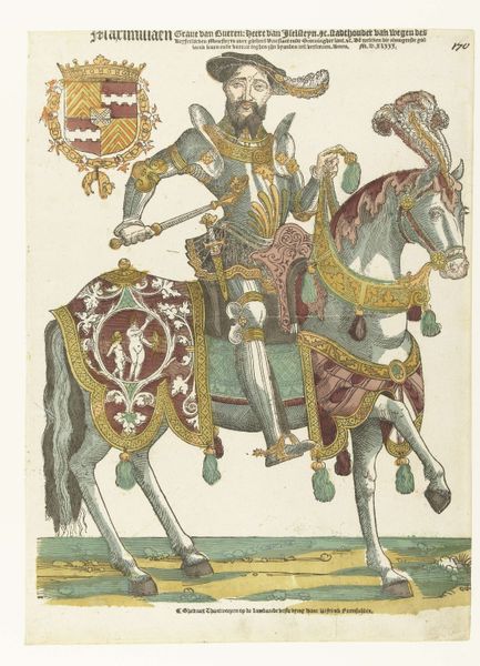
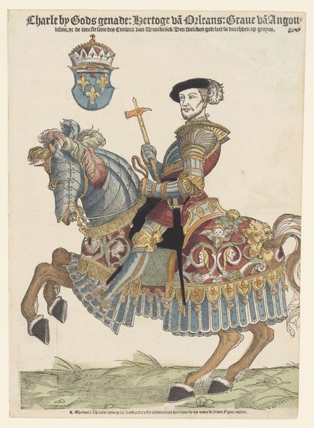
Curator: Ah, here we have “Kronprins Frederik til hest,” a print, combining woodcut and engraving techniques, that was created anonymously between 1790 and 1807. My immediate impression is a striking balance between formal portraiture and folk art aesthetics. Editor: I am captivated by its sheer materiality. The layering of the woodcut and engraving must have been incredibly labour-intensive and I notice the distinct hand-colouring on each impression is bound to add a unique dimension— almost a form of artistic agency—making no two exactly alike. I wonder what sort of workshop it emerged from. Curator: Precisely! That tension is so intriguing. The artist uses linear perspective, albeit a bit naively, to situate Crown Prince Frederick within a broader landscape that recedes towards the background, an urban setting in miniature, which certainly speaks to a Romantic sensibility. Editor: Romanticism is well placed; but my interest is piqued more by the materials used and how the choice of specific engraving methods might reflect both technical limitations and an engagement with accessible imagery for broader public consumption. Consider how woodcuts facilitated cheaper reproductions and were essential to democratising images! Curator: The crude rendering also evokes folk traditions and it is interesting that the artist elected to render the Crown Prince, usually portrayed through highly stylised means, in this mode. Think of it, though—this blend reinforces the ideal of a benevolent, grounded leader—closer to the people! The composition also employs distinct compositional strategies like strong diagonal lines in the horse’s stance, pulling your eye dynamically across the scene and the colour palette enhances that reading through its contrast, which draws you into his regality as the clear focal point. Editor: It's compelling that the horse’s gait and markings resemble something between a working dray horse and a courtly Lipizzaner. The anonymous maker has deftly positioned it into a curious middle ground. What of the inscription text below—could we determine more about the artisanal network that produced it for deeper understanding around reception? Curator: You highlight excellent areas for further study! These formal artistic elements do communicate the values of leadership and identity through cultural tropes. It allows us a window into 18th-century Denmark’s aesthetic values, filtered through a particular sociopolitical context, naturally. Editor: It reveals that the 'high' subject can have the imprint of accessible craft that allows one to think of a wide audience consumption beyond a regal circle. Curator: Quite so; a piece layered in visual codes meant for dual consumption indeed. Editor: Ultimately, though its seeming artlessness yields much regarding process—I am deeply appreciative that it reflects social production of aesthetics at the intersection between royalty and common imagination.
Comments
No comments
Be the first to comment and join the conversation on the ultimate creative platform.
More like this