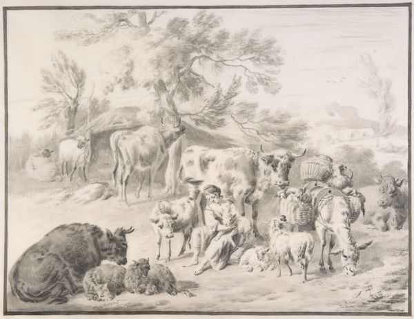
drawing, print, ink, pen
#
drawing
#
ink drawing
#
baroque
#
ink painting
# print
#
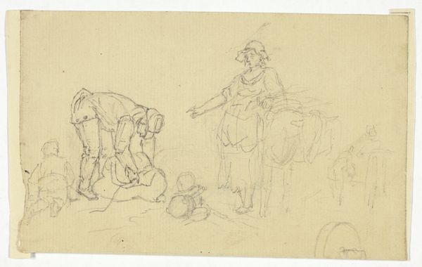
pen sketch
#
pencil sketch
#
landscape
#
ink
#
pen
#
genre-painting
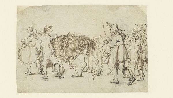
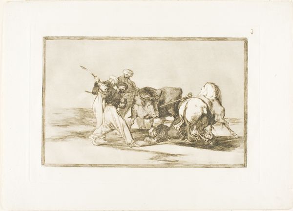
Dimensions: 5-1/8 x 7-1/2 in. (13 x 19.1 cm)
Copyright: Public Domain
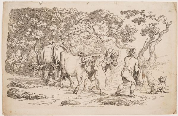
Curator: This ink drawing, simply titled "Rustic Scene," presents such an energetic rural tableau, doesn't it? It dates roughly from 1600 to 1700, placing it firmly in the Baroque period. It's part of the Met's collection. What's your first take? Editor: Well, "energetic" is one word for it. It feels more… agitated? Chaotic, even. The figures are sketched so loosely; they seem caught mid-gesture, like a snapshot of a really bad play. It has some raw and intense qualities though, wouldn't you agree? Curator: Interesting take! For me, the sketchy nature adds to its charm—there’s an immediacy. Look at how the artist uses simple lines to convey movement and emotion. The woman throwing up her arms seems distraught. What do you think is upsetting her so much? I also note how similar this type of scenery seems, the countryside of the era must have been hard and filled with challenges! Editor: Her body language speaks volumes, yes. And it is quite skilled. It is Baroque, though—emotion was kind of the point. Structurally, it's how the diagonals converge. Notice the herdsman's staff versus the lines of the ground. It throws everything off balance! And perhaps alludes to those challenges! This contrasts sharply to, for example, how we have arranged our comfortable galleries to see it now. What irony! Curator: Precisely! It mirrors the chaos within the scene. Also, observe the stark contrast between the fluid lines of the people and the somewhat stiffer depiction of the cow. The scene has so much drama that seems to capture something primal about humanity’s connection to nature—tough living but essential. There is a clear depiction of how things function back then. Editor: Hmm, "primal" might be too generous. Maybe something simpler, something fundamental about labor and survival? To look closer to that cow. There’s a stark division, though—between the free-flowing drawing of figures and that quite basic sketching. Is the artist playing with the hierarchy of importance here? Are we sure about this artist even liking the subject? It would be good to dive deeper to have further assessment and clarity regarding such details. Curator: Now there’s a perspective I hadn’t considered! Perhaps the artist intended that discomfort, highlighting the raw reality of rural life. Regardless, the sketch continues to evoke discussion, right? A tiny ink drawing, full of large ideas! Editor: Indeed, this little whirlwind of ink keeps our curiosity engaged. A great reminder that art doesn't need polish to be engaging; sometimes, it just needs to make us uncomfortable.
Comments
No comments
Be the first to comment and join the conversation on the ultimate creative platform.
More like this