Copyright: Public Domain: Artvee
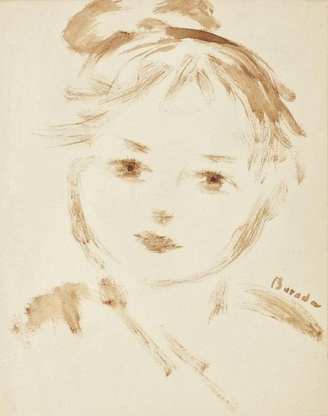
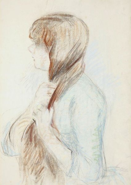
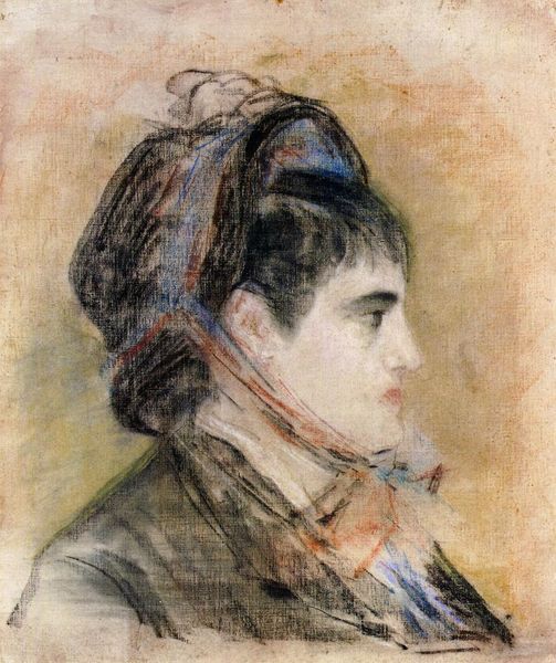
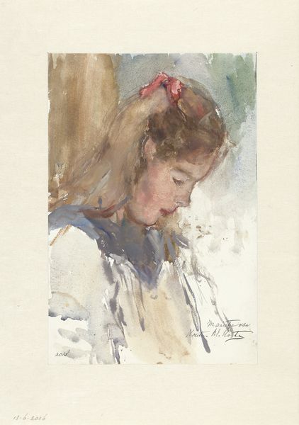
Editor: So, this is Berthe Morisot's pastel drawing, "Jeanne Pontillon à la Capeline," from 1844. It has a really intimate feel, especially with the soft lines and muted colors. How do you interpret this work? Curator: Focusing on the intrinsic qualities of the piece, note how Morisot utilizes the pastel medium. The texture, achieved through layering and blending, is paramount. The visible strokes don’t merely define the figure; they create a sense of movement and fleeting light, yes? Observe the carefully chosen palette—soft greys, greens, and pinks. Do these subdued tones evoke a particular mood? Editor: They do seem to give the piece a wistful feeling, as if looking back. Curator: Indeed. The formal elements contribute significantly to this effect. Also, examine the composition: the subject's profile is positioned slightly off-center. This creates a dynamic tension within the picture plane. The lines defining the figure are delicate, almost hesitant, contrasting with the broader, more assertive strokes in the background. Editor: I see that now! The background almost seems to fade into the figure. Does the choice of a pastel medium itself add to the impression she creates? Curator: Absolutely. The very nature of pastel, its powdery, friable quality, lends itself to capturing impressions and fleeting moments. Unlike oil paint, which allows for more meticulous detail, pastel encourages a more spontaneous, immediate approach, doesn't it? The very choice of medium contributes to our reading. Editor: That’s so interesting! I had never thought about it that way, how much the materials themselves can impact our experience. Curator: Precisely. The structural choices aren't just aesthetic; they contribute to our understanding of the image's essence. By considering these formal elements, we decode the intended message of the artist, revealing how Morisot presents not just a portrait, but an encounter.
Comments
No comments
Be the first to comment and join the conversation on the ultimate creative platform.
More like this