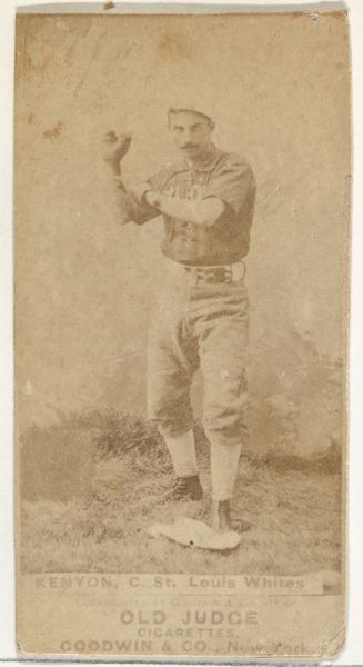
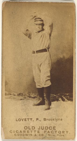
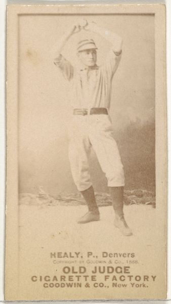
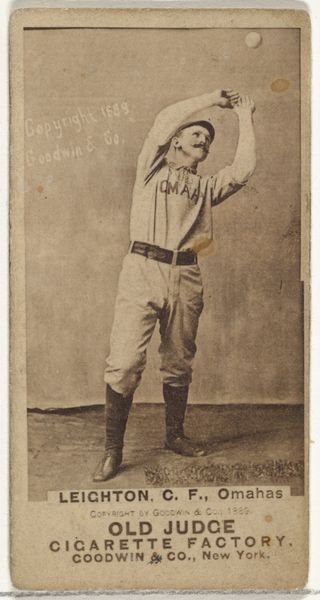
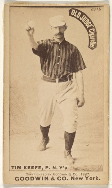
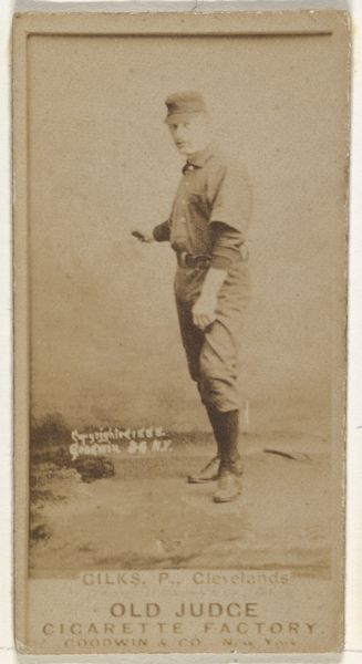
Robert James "Bob" Gilks, Pitcher, Cleveland, from the Old Judge series (N172) for Old Judge Cigarettes 1888
0:00
0:00
drawing, print, photography, albumen-print
#
portrait
#
drawing
#
toned paper
# print
#
baseball
#
photography
#
men
#
athlete
#
albumen-print
Dimensions: sheet: 2 11/16 x 1 3/8 in. (6.9 x 3.5 cm)
Copyright: Public Domain
Curator: Looking at this vintage baseball card, "Robert James 'Bob' Gilks, Pitcher, Cleveland," part of the Old Judge series from 1888, I'm struck by its quiet intensity. What jumps out at you? Editor: It's moody, isn't it? That sepia tone and the way he’s positioned, almost pointing at the viewer…it feels like a challenge. It has the stark intimacy of a daguerreotype, somehow made for a different purpose, of mass marketing of tobacco. The texture alone seems evocative, you can sense the coarse paper stock. Curator: Precisely! It's an albumen print, likely from a photographic negative. Consider how this was distributed; part of a series by Goodwin & Company tucked into Old Judge Cigarettes. It served less as art and more as collectible memorabilia—a token of popular culture, reproduced countless times to be coveted and traded. The photo on toned paper presents Gilks not just as a player, but as an early icon. Editor: Right, there’s something semiotic at work. His uniform, his posture...it's all designed to convey "athlete" and "hero.” Though it also occurs to me this image has some unusual aspects - his eyes stare forward seemingly through the camera, but his fingers appear to gesture toward a lower field of view. Curator: Yes, I’d agree, it disrupts that singular meaning of heroism, right? His focused gaze projects confidence, but the lighting creates an interesting tonal ambivalence. He's highlighted, almost spotlit, but emerging from shadow. So how does the composition function to stabilize an icon in an ambivalent manner? Editor: I like that question. Well, the sharp lines of the text grounds Gilks—his name, team, and the all-important branding, right? Without the printed name there it could perhaps represent almost any earnest youth from this late Victorian moment. It pulls us away from some notion of art toward documentary or even simply trade. The way the text interacts spatially with the pitcher seems very deliberate; that contrast between figure and ground gives you some depth. It also reveals more—what's it telling you? Curator: The formal constraints almost become expressive; a negotiation, perhaps. But in the end what I think about most of all, really, is Gilks himself, preserved and yet distant across more than a century. Editor: For me it’s the subtle tension it brings: is it a personal photograph, a studio setup or advertisement? A memory.
Comments
No comments
Be the first to comment and join the conversation on the ultimate creative platform.
More like this