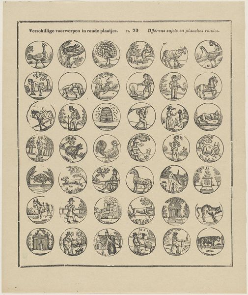
drawing, graphic-art, print, paper, ink, engraving
#
drawing
#
graphic-art
#
baroque
# print
#
old engraving style
#
paper
#
ink
#
geometric
#
pen-ink sketch
#
ink colored
#
line
#
pen work
#
decorative-art
#
engraving
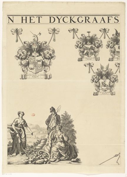
Dimensions: height 507 mm, width 322 mm
Copyright: Rijks Museum: Open Domain
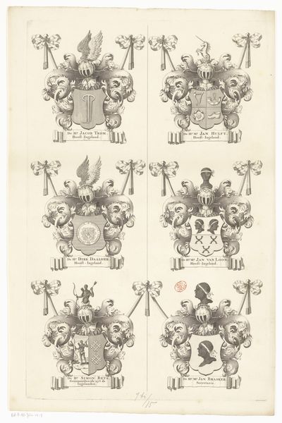
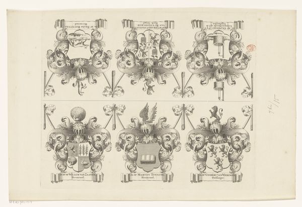
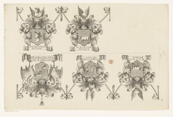
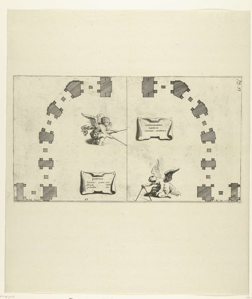
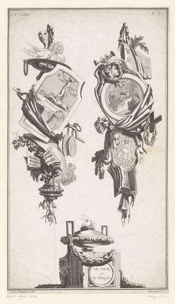
Curator: Here we have "Blad voor wapenrand bij een kaart van de Purmer (vierde blad)," dating back to 1683. It’s currently held in the Rijksmuseum. It’s attributed to an anonymous artist and presents as a meticulously crafted drawing. Editor: The immediate impact is of complex heraldry. Each crest has such varied, and at times quite strange, symbolic figures set within a rigorous compositional style, it seems as much about pattern as representation. Curator: Indeed. Looking at the production of these sorts of images, it reflects a rising interest in recording territory but also consolidating family power through representation. The anonymous artist worked with engraving, ink, and paper to essentially produce what would have been part of a larger map or decorative element for an important commission. The use of geometric shapes within each design and their meticulous duplication signals that printing capabilities made works such as this highly sought after. Editor: What strikes me formally is the use of line. Notice how the artist uses line weight to create depth and hierarchy, essentially creating a highly elaborate pen work aesthetic. Each emblem functions as its own symbolic ecosystem with the animals and figures playing an important semantic role. They all signify something—wealth, land, ancestry... It's like reading a family’s structural history, through line, shape and form. Curator: The baroque exuberance, evident in the decorative borders, needs to be understood in the social climate. It was all about conveying wealth through craft. Each curve, each meticulously etched line, speaks to the resources required for commissioning work of this kind. It represents the labour involved and the subsequent economic impact, especially at a time when land and title denoted status and control. Editor: I agree. From a formal standpoint, the way these emblems mirror each other creates a beautiful pattern that goes beyond heraldry. It explores form in relation to social history and production as we have been discussing, yes, but even removed of all knowledge about history, it creates beautiful pattern work, one emblem echoing another with slight variation, offering us visual interest while speaking a complicated structural and familial narrative. Curator: Examining this, what stands out is its purpose, beyond simple aesthetics, reflecting the interplay of craftsmanship, economy, and societal values that underscore such images, highlighting that these detailed works carry much significance, beyond initial visual assessment. Editor: Ultimately, whether we explore the material production of its creation or study it as a sophisticated exploration of baroque design, it clearly communicates aspects about hierarchy and wealth during its historical context.
Comments
No comments
Be the first to comment and join the conversation on the ultimate creative platform.
More like this