ceramic, porcelain, sculpture
#
simple decoration style
#
ceramic
#
jewelry design
#
flower
#
porcelain
#
culinary art
#
black and white theme
#
appetizing
#
food illustration
#
stoneware
#
sculpture
#
macro photography
#
food art
#
food photography
#
decorative-art
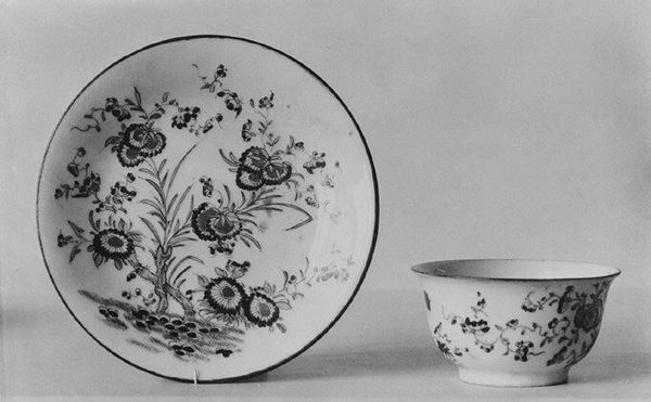
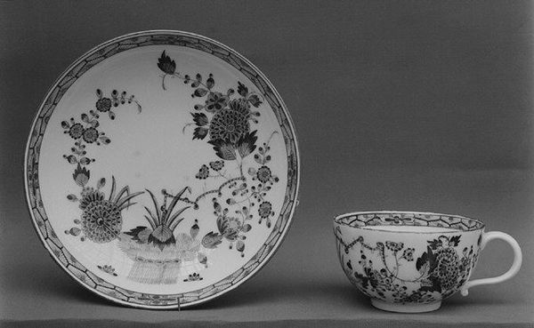
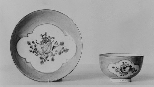
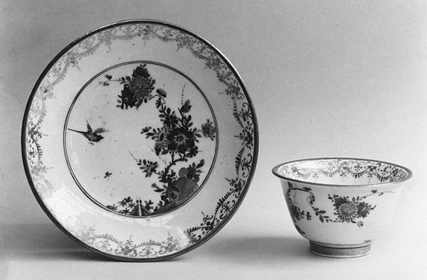
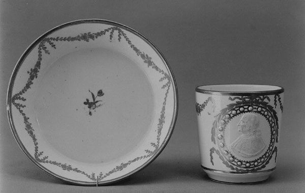
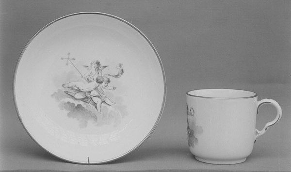
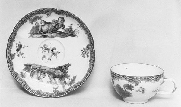
Dimensions: Height: 1 5/8 in. (4.1 cm)
Copyright: Public Domain
Editor: This is a cup, dating from the 18th century and made by Meissen Manufactory. It's porcelain with a simple, almost stark, black and white floral design. What is most striking about the composition of the cup, in your opinion? Curator: The piece embodies a dialogue between form and decoration, expressed with clarity and precision. Note how the curvilinear form of the cup is echoed, yet challenged, by the painted botanical arrangements. Consider how the artist contrasts the cup's three-dimensional volume with the saucer's two-dimensional surface. How might the negative space interact with the cup? Editor: The negative space highlights the curvature of the cup and creates a rhythm. Do you think the contrast enhances the floral motifs? Curator: Indeed. The artist harnesses both symmetry and asymmetry within each floral motif, creating a vibrant interplay of elements. It invites us to analyze how Meissen consciously employed a restricted palette to explore depth and texture. Editor: I see that. So, you're suggesting that the artist intentionally designed this for structural examination as well as functionality? Curator: Precisely. Reflect on how the placement of these botanical arrangements direct the eye. Does it alter your perception? Consider also how the ceramic material interacts with light, how the glazing and painted areas refract light, contributing to a subtly dynamic viewing experience. Editor: This has shifted my perception. I didn't initially recognize how complex the interaction of elements in something that seemed so minimal is. Curator: Yes, by isolating and decoding visual elements, such as the interplay of positive and negative spaces and how light is handled in the design, we unlock a more comprehensive aesthetic understanding.
Comments
No comments
Be the first to comment and join the conversation on the ultimate creative platform.
More like this