graphic-art, print, typography, poster, engraving
#
script typeface
#
graphic-art
#
script typography
#
photo restoration
#
dutch-golden-age
# print
#
old engraving style
#
typography
#
poster
#
engraving
Dimensions: height 233 mm, width 150 mm
Copyright: Rijks Museum: Open Domain
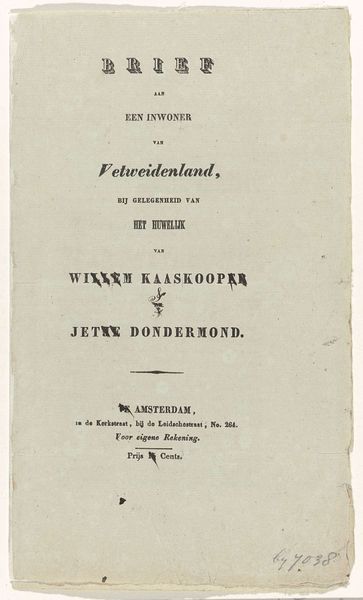
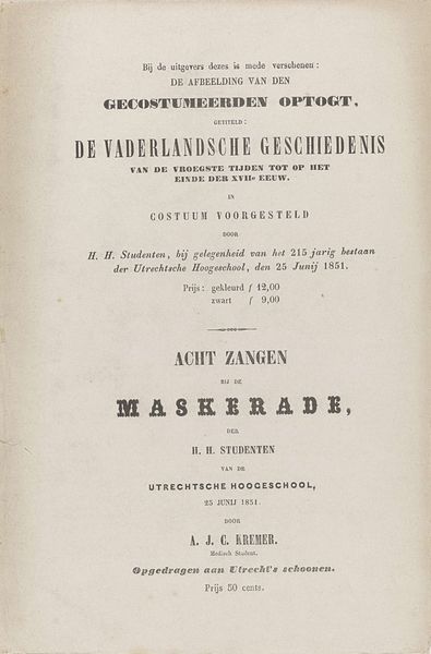
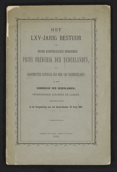
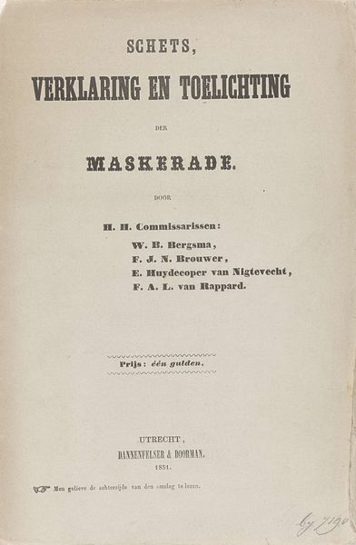
Editor: Here we have a typographical print, 'Plattegrond van de Wereldtentoonstelling te Amsterdam, 1883,' essentially a map for the World Fair in Amsterdam from 1883. It's stark, almost minimalist, relying on text and a small coat of arms. What catches your eye about it? Curator: You know, it's funny. A map is supposed to orient us, but this cover feels like a portal to a lost world. It whispers of that 1883 Amsterdam World's Fair. It wasn't just about showing off; it was about dreams of progress, about empire, about defining what 'modern' meant back then, a real vortex of the world concentrated in Amsterdam. The typography becomes symbolic, like a set design meant to be visually grand. What do you feel? Does it spark the desire for travel, for exploration? Editor: Absolutely! It makes me think about what they hoped to achieve and project. What do you make of the Amsterdam coat of arms beneath the main text? The lions are guarding the city's identity, or perhaps even 'civilization' as they understood it then. Curator: Exactly! It's like they're saying, "Come explore, but remember who's in charge." Consider also what was omitted: what biases and hidden agendas might this 'flat ground' map obscure, consciously or unconsciously? Editor: So it's not just a floor plan, but an emblem of power and perspective. Curator: Right. This isn’t just graphic art; it’s a declaration, wrapped up in a neat little package. And of course this would be reprinted in a major paper – the *Algemeen Handelsblad* – a clever marketing tactic too, yes? Editor: I didn't consider the marketing angle; thanks! I guess these historical documents speak volumes, even when they appear so simple on the surface.
Comments
No comments
Be the first to comment and join the conversation on the ultimate creative platform.
