coloured-pencil, painting, plein-air, watercolor
#
portrait
#
coloured-pencil
#
dutch-golden-age
#
painting
#
plein-air
#
dog
#
landscape
#
watercolor
#
coloured pencil
#
genre-painting
Dimensions: height 46 mm, width 85 mm
Copyright: Rijks Museum: Open Domain
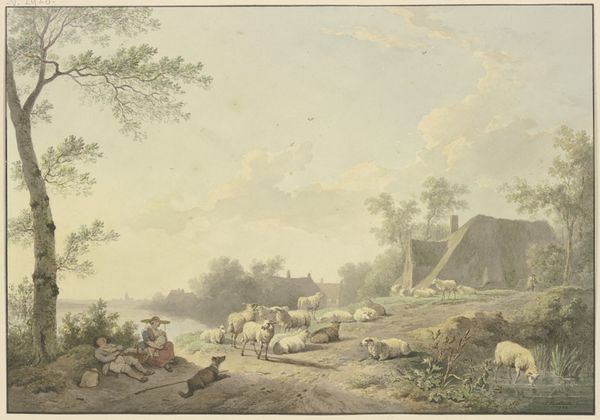
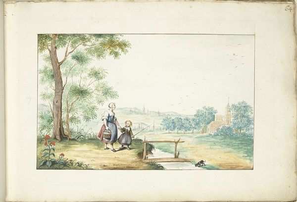
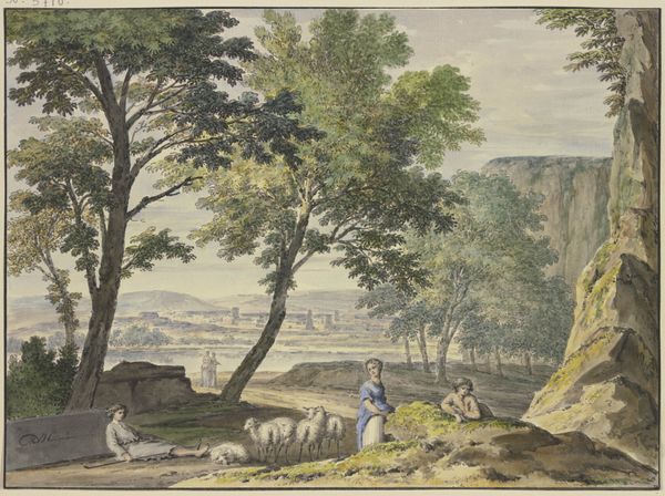
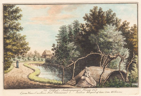
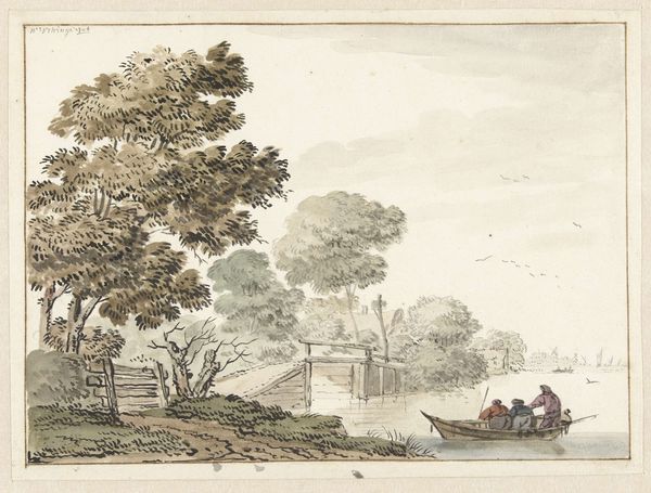
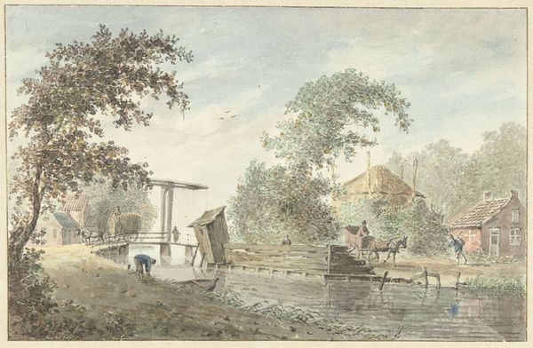
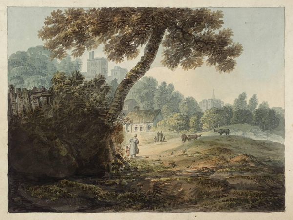
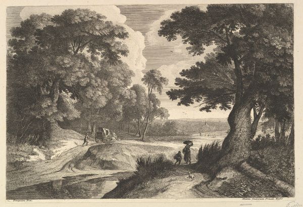
Editor: So, this delightful artwork is called "Liggende hond," which I believe translates to "Lying Dog," by Cornelis Saftleven, created sometime between 1617 and 1681. It looks like it’s done in coloured pencil and watercolor. It gives me a sense of peaceful, everyday life. What strikes you most about the composition? Curator: Primarily, I'm drawn to how Saftleven constructs a spatial arrangement using carefully calibrated chromatic modulations and geometric forms. Notice how the muted palette, dominated by earth tones and subtle greens, guides the eye, creating a rhythmic progression across the plane. How does the linearity of the bridge interact with the organic shapes of the trees? Editor: Well, the bridge creates a strong horizontal line that contrasts with the softer, rounder shapes of the trees and clouds, almost like a barrier separating two parts of the scene. But it's also a connector, isn't it, visually linking the figures on the left with the house and figure on the water to the right? Curator: Precisely. And the materiality further enhances this dialectic: the smoothness of the watercolor contrasts with the perceived texture of the rendered foliage. These contrasting textures, alongside the geometrical structures, function to draw the viewer into a complex network of signs and forms. Have you also considered the subtle interplay between light and shadow? Editor: Yes, it's quite subdued, not dramatic at all. It contributes to that overall feeling of tranquility. I see what you mean about those geometries though. So even in this calm scene, Saftleven’s use of lines, forms and colour creates complexity. Curator: Indeed. Focusing on these formal aspects offers a richer understanding beyond mere representation. It reveals a carefully constructed visual experience. Editor: It certainly shifts my perception. I’ll definitely pay more attention to structure and material now!
Comments
No comments
Be the first to comment and join the conversation on the ultimate creative platform.
