silver, print, engraving
#
portrait
#
silver
#
baroque
# print
#
old engraving style
#
historical photography
#
line
#
engraving
Dimensions: height 305 mm, width 205 mm
Copyright: Rijks Museum: Open Domain
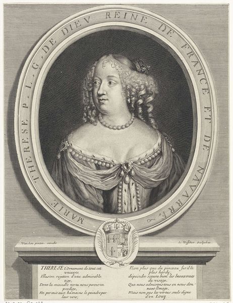
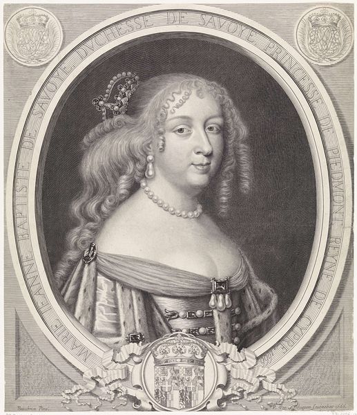
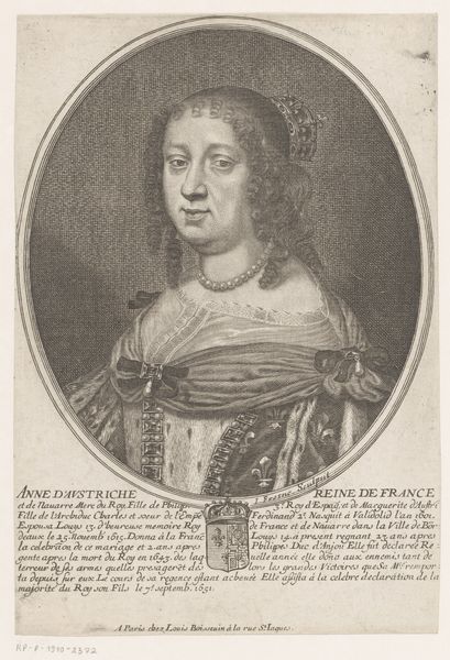
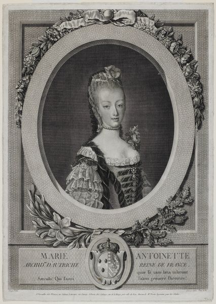
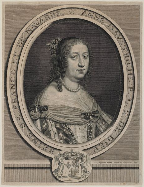
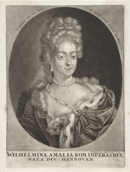
Editor: We’re looking at “Portret van Isabelle Francoise Walraven,” an engraving dating somewhere between 1696 and 1721, by Jan Baptist Berterham. The detail is incredible, but there's a formality about it that feels...distant, somehow. What catches your eye? Curator: You know, I see a world captured in monochrome – an invitation to look closer. Notice the meticulous line work, almost obsessively rendered? And, there’s Isabelle herself, her gaze direct, bearing a weight, doesn't she? Does that weight feel different than how noble portraiture portrays women today? Editor: I suppose I expected something a little more… flattering? Less stern, maybe. Curator: Perhaps. But beauty standards are mirages reflecting cultural tides. Consider this piece within its Baroque frame: ostentation, sure, but also vulnerability etched into the silver nitrate, wouldn’t you say? That text in the oval is interesting, too... “QUIS PREPARAT CORVO ESCAM SUAM?” I wonder about the meaning? Editor: "Who prepares food for the raven?" Intriguing. Does the artist provide us with a clue with her stern face, maybe reflecting what it took to maintain that powerful position in the 17th-18th century? Curator: An excellent reading! Yes, it hints at survival, maybe even cunning… That raven doesn’t just wait for food to fall into its beak, does it? It navigates the world, and so did Isabelle, it seems. Now, knowing it is silver print and etching, can you feel what that imparts? Editor: It's fascinating how the rigid technique – the etching – actually heightens the psychological intensity. The silver adds a sheen that makes her more real and somehow still unreachable. Thank you; I have a whole new appreciation for her and this style.
Comments
No comments
Be the first to comment and join the conversation on the ultimate creative platform.
More like this