drawing, textile
#
drawing
#
textile
#
romanticism
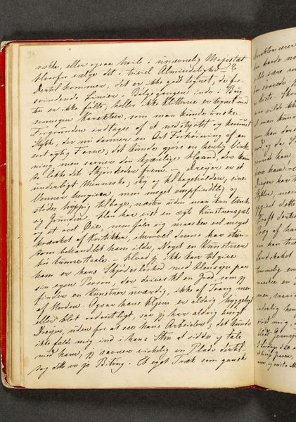
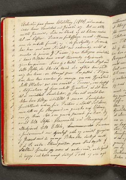
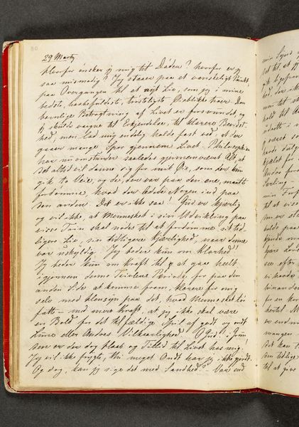
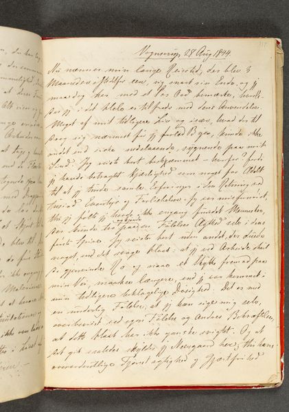
Dimensions: 192 mm (height) x 133 mm (width) (bladmaal)
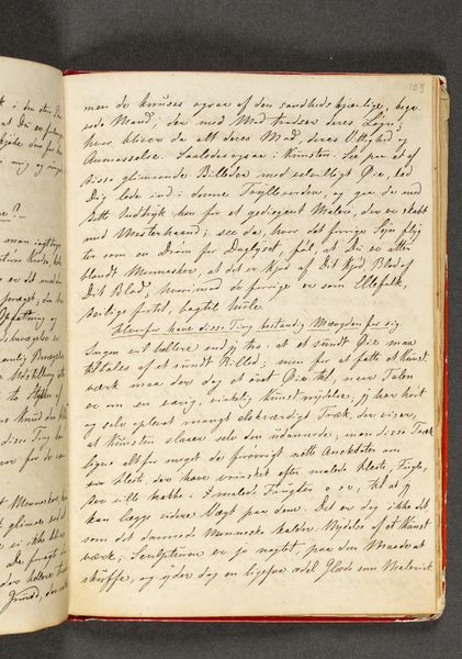
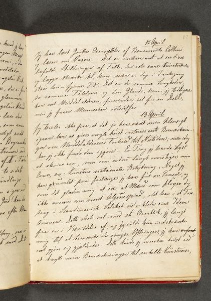
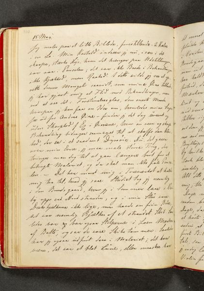
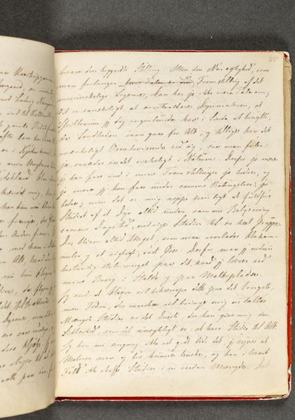
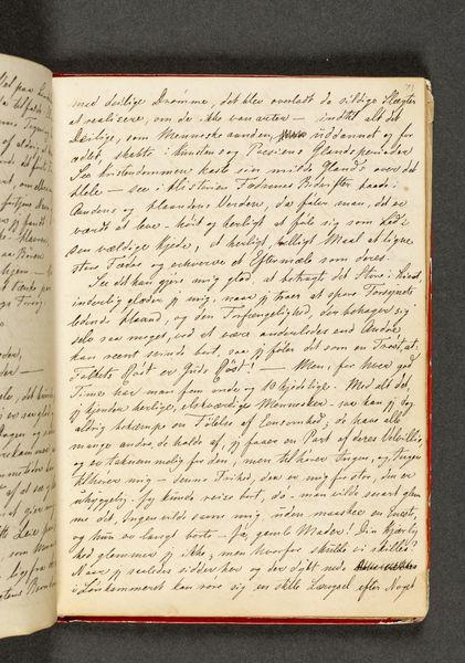
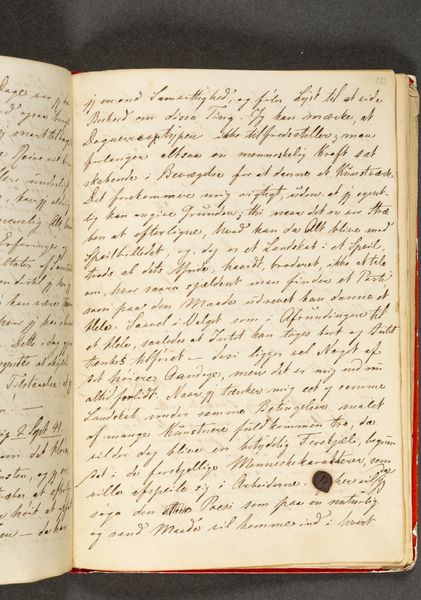
Editor: Here we have "Dagbog. Side 105," a page from a diary dated 1844 by Johan Thomas Lundbye, currently held at the SMK, the National Gallery of Denmark. It's a fascinating peek into the artist’s thoughts, entirely rendered in detailed script. The page appears quite dense and I feel as though I would need to have better literacy in Danish handwriting to truly get a feel for it. What catches your eye, Professor, when you examine this particular diary entry? Curator: Formally, the page is a carefully structured plane. Consider the careful distribution of the calligraphic marks across its surface. The texture, achieved through ink on what appears to be woven textile, offers a unique tactile dimension, even in reproduction. What is particularly interesting is how the linguistic structures serve as compositional elements, shaping visual rhythms and balances on the page. Notice how these units combine to form a distinct visual arrangement? Editor: Yes, now that you mention it, the variations in ink darkness create a landscape of sorts, a visual ebb and flow across the page. The straight ruled lines also ground and organize the thoughts on the page into coherent paragraphs. It seems intentional, a sort of visual architecture underpinning the written words. Is this attention to detail characteristic of Lundbye's approach to all of his written work? Curator: Without studying additional pieces, it is impossible to confirm whether this approach is intrinsic to all of Lundbye’s work, although you do rightly call out its formal impact. Now consider: do you think an understanding of the text contained enriches one's reading of these elements, or does the strength of their compositional role on the page supersede meaning? Editor: That is a difficult question. The two do seem intertwined; I cannot really say whether they complement or contrast each other in intention and aesthetic effect. Curator: Precisely! This inherent tension underscores how the formal qualities can exist independently but are undeniably enriched by, and enriching to, their linguistic counterpart. Editor: I see what you mean. I hadn’t thought about the interaction of script and drawing being its own type of artistic composition before. Thank you. Curator: My pleasure. It is always worth remembering how elements within a work coexist and contribute to the viewer experience.
Comments
No comments
Be the first to comment and join the conversation on the ultimate creative platform.
More like this