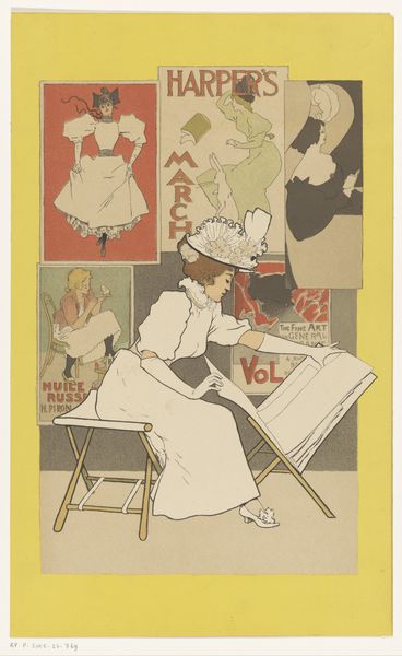
Bandontwerp voor: Nannie van Wehl, Het moeilijke begin, 1915 before 1915
0:00
0:00
drawing, watercolor, ink, poster
#
portrait
#
drawing
#
art-nouveau
#
caricature
#
figuration
#
watercolor
#
ink
#
watercolour illustration
#
poster
Dimensions: height 277 mm, width 187 mm
Copyright: Rijks Museum: Open Domain
Willy Sluiter made this design for a book cover in 1915 using watercolor and ink. The marks are pretty direct, nothing fussy, just line and wash. You can see the hand of the artist making conscious decisions on how to define the subject. The palette is restrained: blues, browns, and creams, with black lettering. The paper shines through, allowing the ground to become an active element. The figure is captured mid-motion, her gaze lowered, focused on the act of writing, it's a very relatable scene, I think. See how the brown of the table extends upward into the figure and lettering of the book title? It’s a smart compositional trick that gives the scene balance. Sluiter's background in illustration shines through, as does an understanding of how to draw the viewer into the narrative through subtle gestures. Consider other illustrators like Ethel Reed, who also blurred the lines between fine art and commercial illustration. The beauty of art lies in its ability to embrace ambiguity and multiple readings.
Comments
No comments
Be the first to comment and join the conversation on the ultimate creative platform.
More like this