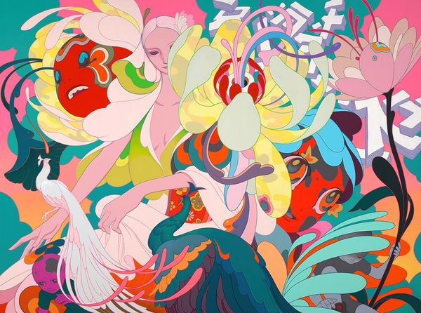
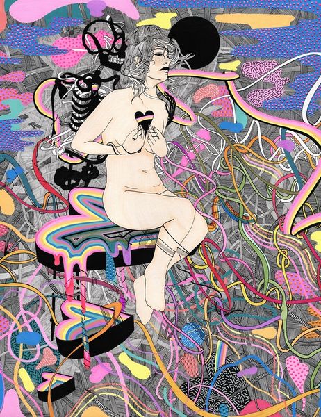
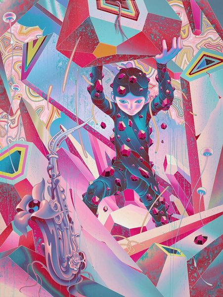
acrylic-paint
#
pop-surrealism
#
landscape
#
fantasy-art
#
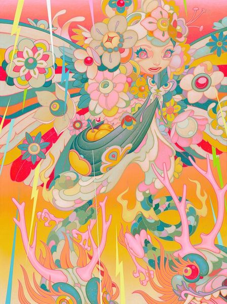
acrylic-paint
#
figuration
#
surrealism
#
erotic-art
Copyright: Modern Artists: Artvee
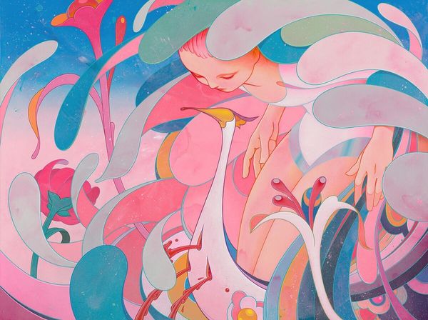
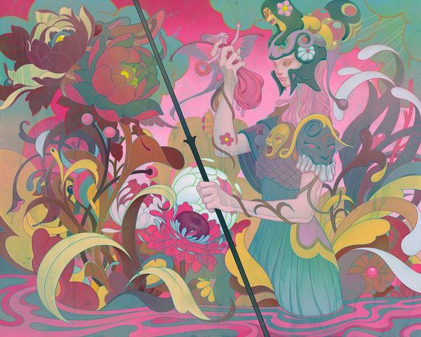
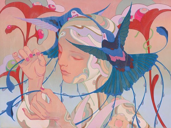
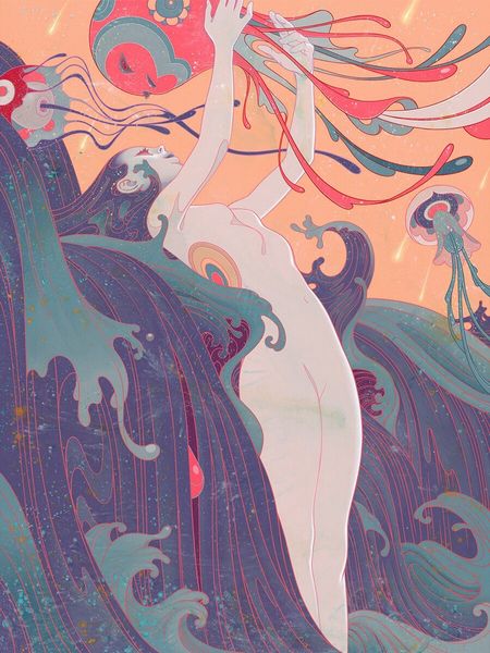
James Jean made *Adrift III*, and everything about the making of it, the colour, the line, feels intensely considered. The surface is smooth and polished, it almost has the sheen of an advertisement; which makes sense, given his background. But I think that’s part of the point, that it sucks you in with its own kind of aesthetic gravity. Look at the way those colours are used, that pink and grey-blue, which shouldn’t work together at all, but they really do. It’s a bit like the way Elizabeth Murray would build forms out of colour, letting the relationships between tones suggest a kind of spatial dynamic. The way the body is rendered is beautiful, idealized, but not in a way that feels lifeless or contrived. Jean always reminds me a bit of Yoshitaka Amano, that same fluidity of line and dreamy palette, but he's very much doing his own thing. Art is so exciting that it's just a big conversation between artists across time. The idea is not to be too literal, to let the work breathe.
Comments
No comments
Be the first to comment and join the conversation on the ultimate creative platform.
More like this