painting, plein-air, oil-paint
#
painting
#
impressionism
#
plein-air
#
oil-paint
#
landscape
#
impressionist landscape
#
oil painting
#
cityscape
#
genre-painting
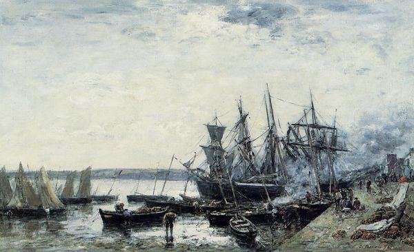
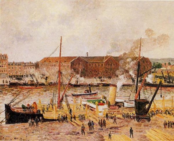
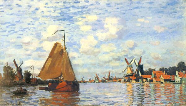
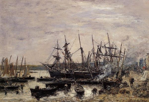
Dimensions: 63 x 100 cm
Copyright: Public domain
Editor: So, here we have Manet’s "The Port of Bordeaux," painted in 1871. It's an oil painting. The number of boats is a lot! It makes for a busy composition, and the grey palette evokes a somber mood, despite the scene's activity. What strikes you about this work? Curator: The composition presents a fascinating interplay of verticals and horizontals. Observe how the masts of the ships create a dense network of vertical lines, countered by the horizontal emphasis of the quayside and the water's surface. Editor: I see what you mean. It almost feels like two separate planes. Is that contrast significant? Curator: It creates a visual tension, yes. The brushwork, quite characteristic of Manet, is also worthy of consideration. Notice the visible, almost hasty strokes, particularly in the depiction of the water and the sky. Do these rapid, broken strokes detract or add to the image? Editor: I think they add to it! It gives it a sense of immediacy. It feels like a snapshot in time. It almost vibrates with energy, which is interesting considering how muted the colours are. Curator: Precisely. Now, consider the limited palette – the dominance of greys, blues, and browns. How does this restrain contribute to the overall meaning? Editor: I think it helps him draw your eye to different points – like those masts, and how they point upwards towards the spires of that building at the back of the port. Curator: A satisfying observation. It showcases the tension between representation and abstraction so inherent in early Impressionism. Editor: It's amazing how much can be decoded from just line and colour. Thanks! Curator: Indeed. Every brushstroke has something to communicate to the thoughtful observer.
Comments
No comments
Be the first to comment and join the conversation on the ultimate creative platform.
More like this