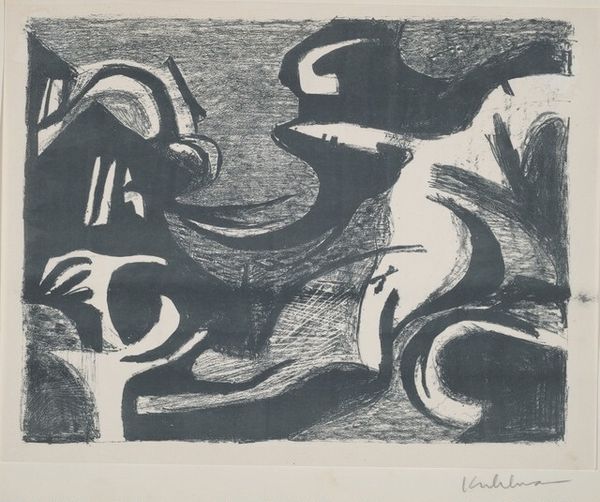
graphic-art, print, woodcut
#
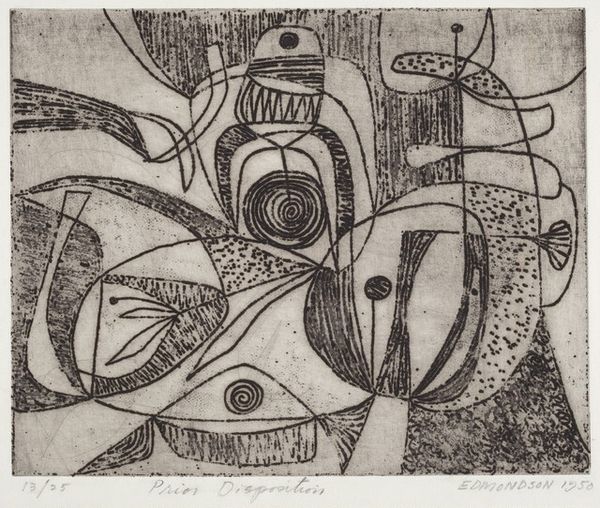
de-stijl
#
graphic-art
#
pen drawing
# print
#
pen sketch
#
ink line art
#
geometric
#
pen-ink sketch
#
expressionism
#
woodcut
#
abstraction
#
line
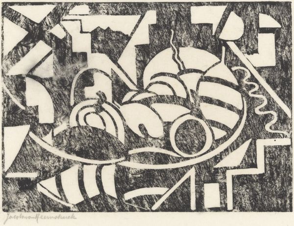
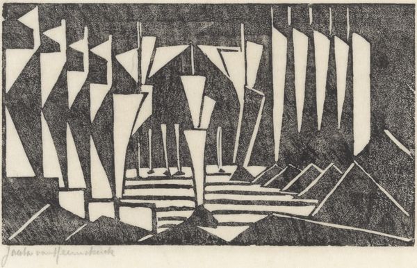
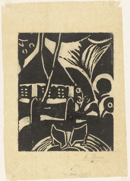
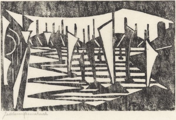
Dimensions: height 255 mm, width 348 mm
Copyright: Rijks Museum: Open Domain
Curator: Jacoba van Heemskerck's "Scheefliggend zeilschip," created sometime between 1886 and 1923, resides here at the Rijksmuseum. It’s rendered as a woodcut print, showcasing the artist’s distinctive style. Editor: My first impression is one of disorientation. The skewed perspective and sharp contrasts create a sense of instability and perhaps even chaos. It is hard to fully tell what is what here without really looking. Curator: Indeed, the instability is palpable. Heemskerck was deeply invested in abstraction, drawing upon a language of geometric forms. Her roots in expressionism speak to the emotional currents beneath the surface of this abstract vessel. I'm especially drawn to those ambiguous orbs in the upper portion—perhaps stylized suns, or even representations of human faces. Do you see the possibility for such interpretations? Editor: I find my attention gravitating to the black and white. The stark juxtaposition isn't just visually striking; it dictates the way the composition is structured, forcing a flattening of space and a dialogue between positive and negative shapes. Curator: And what of the symbolic weight carried by ships? They often signify journeys, transitions, the self in search of meaning… In this case, a voyage that is obviously not going to be easy. The simplification lends an almost archetypal quality. I also appreciate the fact that you see how it also recalls cultural anxiety during the inter-war period and rapid industrial change. The abstraction seems less about aesthetics, and more about grappling with fundamental questions of identity. Editor: Absolutely, the line work creates a sense of rhythmic energy despite the overall visual disharmony. By disrupting conventional perspective, the piece forces us to consider space, and how a given medium and materials interact. Curator: Looking closely I am convinced of that is an emotional map charting the psychological and societal currents of its time, a voyage into the subconscious rendered visible, in ink. Editor: And for me, it's in this play of light and shadow that gives such emotional intensity to this particular piece.
Comments
No comments
Be the first to comment and join the conversation on the ultimate creative platform.
More like this