photography, gelatin-silver-print
#
portrait
#
photography
#
gelatin-silver-print
#
modernism
#
realism
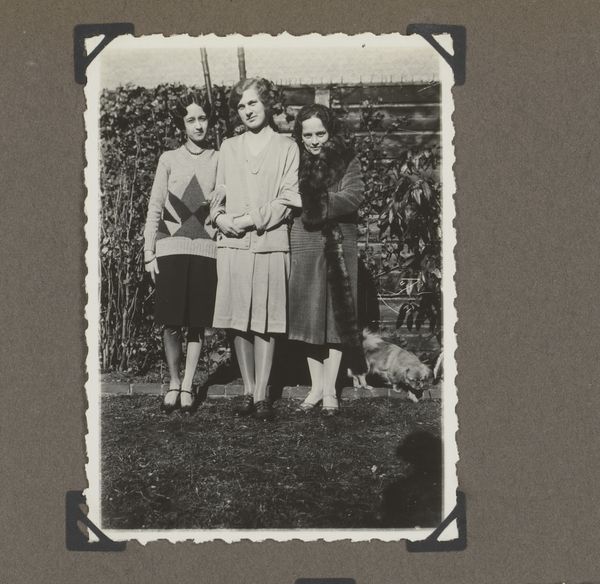
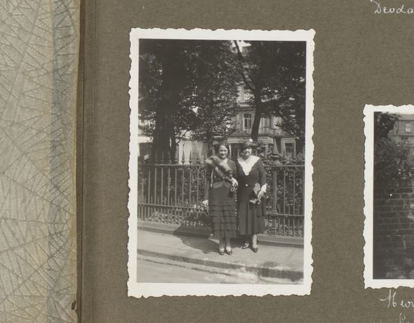
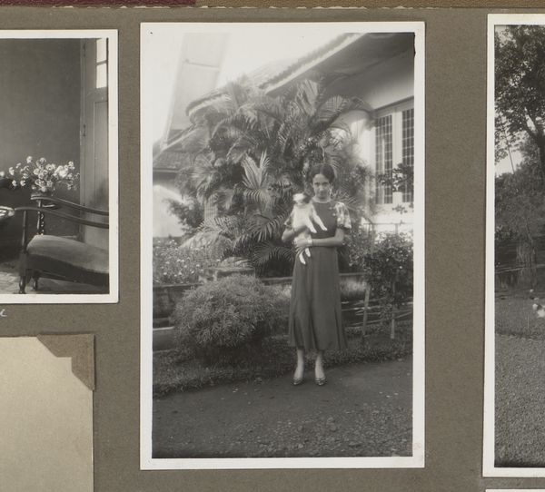
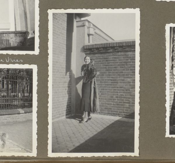
Dimensions: height 113 mm, width 69 mm
Copyright: Rijks Museum: Open Domain
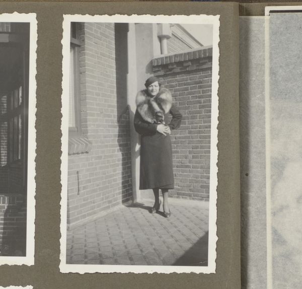
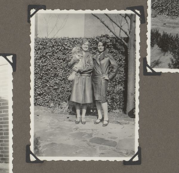
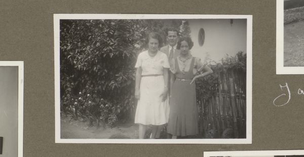
Editor: Here we have a gelatin-silver print dating from 1934 to 1935, titled "Portret van Dootje en Wilhelmina van Zijll de Jong." The symmetry of the composition, framing these women in their garden, is really striking. What catches your eye when you look at this photograph? Curator: Immediately, it’s the interplay of light and shadow. Notice how the sharp focus renders the textures of their clothing and the brickwork of the house behind them, contrasting with the softer focus of the foliage. It creates a spatial depth, drawing the viewer's eye into the scene. Does the composition's reliance on stark geometry, a common Modernist tactic, tell us something about its subject? Editor: That's interesting. I hadn't considered how much the light contributes to the photograph's sense of depth and almost geometrical austerity. It gives it a more formal feel, but would this formalism obscure more than it reveals? Curator: Perhaps. The sharp, unromantic quality, characteristic of much photography of this period, might distance the viewer from the subjects' inner lives. Consider how the tonal range, moving from the deepest blacks to almost paper white, establishes the formal structure, almost as if the emotional landscape is secondary. What is the impact of relegating the botanical ornament as counterpoint? Editor: I see what you mean. It's as if the photographer prioritized clarity and form over a sentimental portrayal. By reducing these figures to formal elements, he emphasizes shape. This might encourage us to see them in their societal roles as much as to see them as individual women. I'm learning that photographs, like other works of art, gain value through their formal presentation, thank you. Curator: And I am reminded that an effective reading reveals both historical setting and formal setting, to consider photography as a fine art.
Comments
No comments
Be the first to comment and join the conversation on the ultimate creative platform.
More like this