#
pencil drawn
#
aged paper
#
toned paper
#
light pencil work
#
pencil sketch
#
old engraving style
#
charcoal drawing
#
pencil drawing
#
pencil work
#
golden font
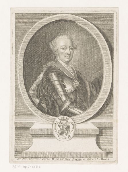
Dimensions: height 156 mm, width 98 mm
Copyright: Rijks Museum: Open Domain
Editor: Here we have "Portret van Peter II van Rusland," made sometime between 1727 and 1767 by Johann Martin Bernigeroth. The piece has such an austere and dignified quality in the sitter’s gaze, heightened by the oval frame. How do you interpret the structural choices in this portrait? Curator: This portrait presents an intriguing study in formal contrasts. Notice the stark, linear background. How does this grid interact with the ornate, curved lines of the portrait itself, specifically within the clothing and the rendering of the Czar's hair? Editor: I see what you mean; the regimented lines behind him definitely throw the curls and fabric into sharper relief. Is it intended to signify something about his character or status, contrasting structure against... opulence? Curator: Precisely. Observe, too, how the lines create a planar effect, pushing the subject forward. Bernigeroth orchestrates a tension between depth and flatness, a dichotomy echoed in the detail of the armour versus the soft texture of his cloak. What is the effect of that tonal variation for you? Editor: The tonal range does separate the textural qualities and brings forward the highly reflective metal as a symbol of rank. All these elements combine to flatten, compress, and ultimately emphasize specific shapes and patterns. I never would have considered that at first glance. Curator: Formal analysis allows us a way to move beyond the biographical to assess authorial decisions concerning composition and the visual strategies used to present it. Editor: Absolutely. Seeing how Bernigeroth has carefully layered line and texture adds another dimension to the viewing experience. Thanks for walking me through that.
Comments
No comments
Be the first to comment and join the conversation on the ultimate creative platform.
More like this