print, paper, typography
#
baroque
# print
#
paper
#
typography
Dimensions: height 315 mm, width 200 mm
Copyright: Rijks Museum: Open Domain
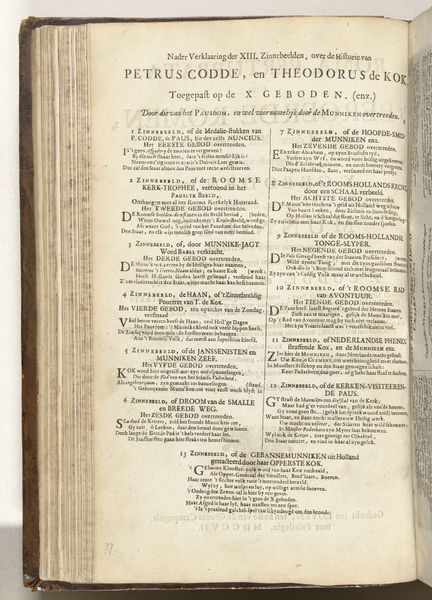
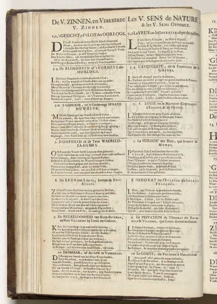
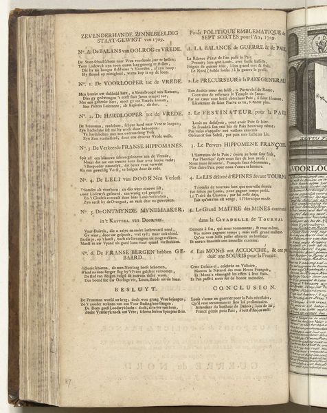
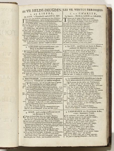
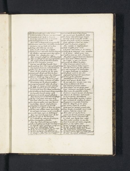
Editor: We’re looking at “Inhoudsopgave voor: Het Palmhof der Bondgenooten, 1708,” a print on paper with typography by Carel Allard. It’s housed at the Rijksmuseum and was made in 1708, which is truly remarkable! This piece looks so full of rich text. I find the old-fashioned text styles intimidating, where do I even begin to interpret this? Curator: As a formalist, I see several structural elements at play. Consider how the artist has organized the text into distinct blocks and columns, using variations in font size and weight to create a visual hierarchy. Notice the borders and separations, clearly designed to guide the reader's eye through the information. The dense packing of text and graphic elements reflects Baroque sensibilities; it is concerned more with lavish ornamental structure, rather than open space. What’s most striking to you about the formal choices? Editor: I notice that the typography almost takes on the character of an image, more like an artistic whole rather than as purely text to be read. Curator: Precisely! We can look at the materiality of the paper itself. It is aged and carries the marks of time, like foxing, that enhance its texture, which are inseparable from the printed elements, or what you called image, suggesting history’s imprint. Editor: That makes me consider the physical presence of this index, its status as an object—a container of meaning through form. Thanks, that's helped a lot in considering this work. Curator: Indeed. By emphasizing the interplay between material and design, we begin to uncover a deeper understanding of how this Baroque print functions both visually and conceptually.
Comments
No comments
Be the first to comment and join the conversation on the ultimate creative platform.
More like this