Copyright: CC0 1.0
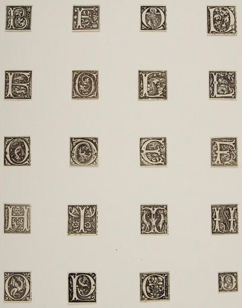
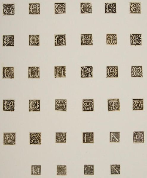
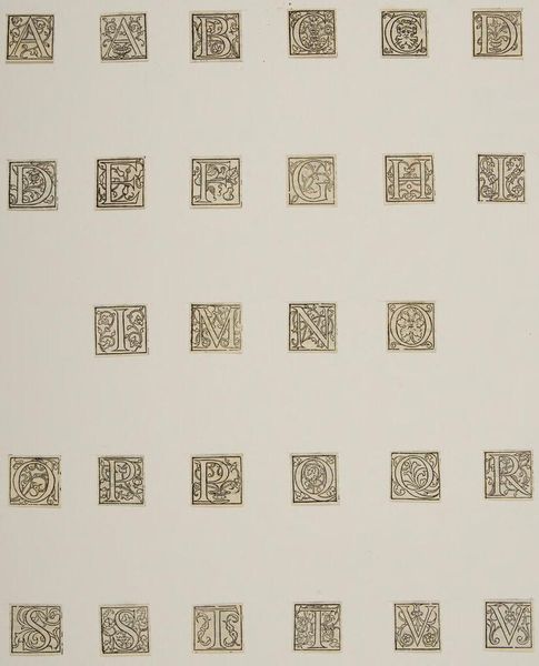
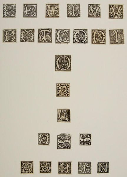
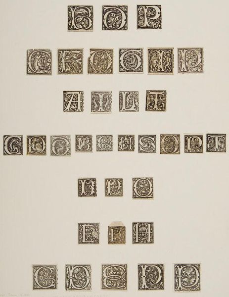
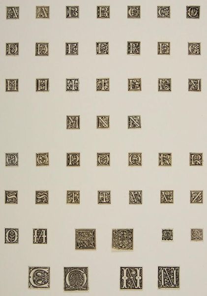
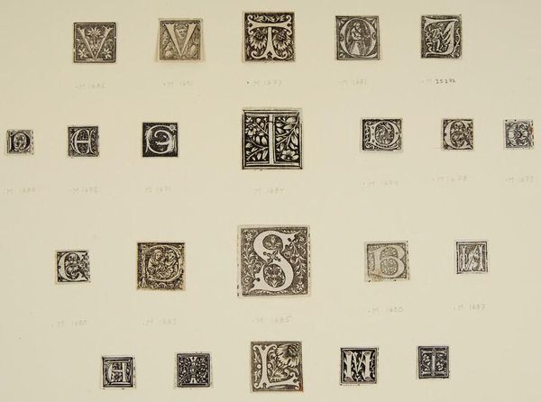
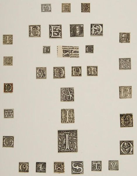
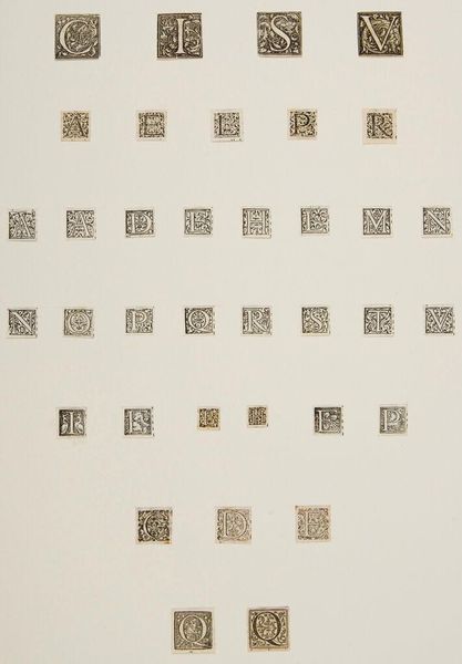
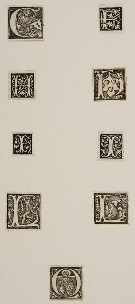
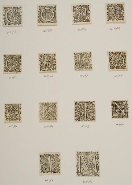
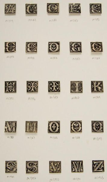
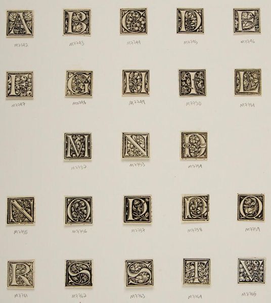
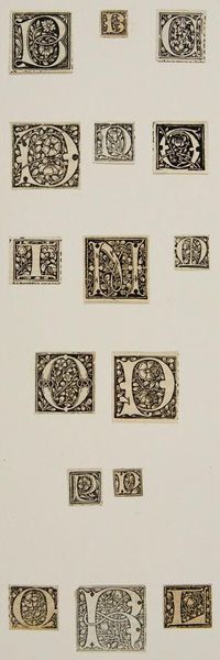
Editor: This is "Letter T," an undated work by an anonymous artist, housed in the Harvard Art Museums. It's a collection of ornate letterforms. What do you see in the arrangement of these designs? Curator: The organization employs a grid, a deliberate structure providing each letter form with equal visual weight. Note the contrast between the density of the black ink and the negative space. Do you observe any stylistic consistency across the letterforms? Editor: They all seem to be set within these square borders, but each letter has a unique, swirling design. It's almost like a game of visual hide-and-seek. Curator: Precisely. The artist masterfully balances uniformity and individuality. Each letter is a self-contained unit, yet contributes to the overall composition. The absence of color encourages us to focus on line, shape, and pattern. Editor: I see that now. It is less about the individual letter and more about the collection of forms. Curator: Exactly. Focusing on the formal arrangement allows for appreciation of its pure design qualities. I've found that this helps in understanding the artistic intent.
Comments
No comments
Be the first to comment and join the conversation on the ultimate creative platform.
More like this