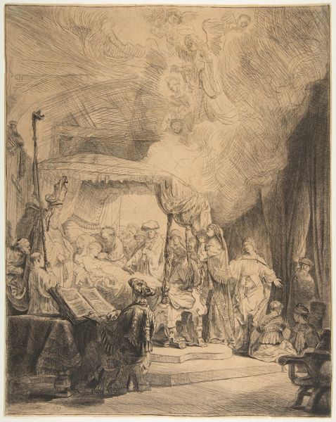
drawing, print, etching, ink, engraving
#
drawing
#
baroque
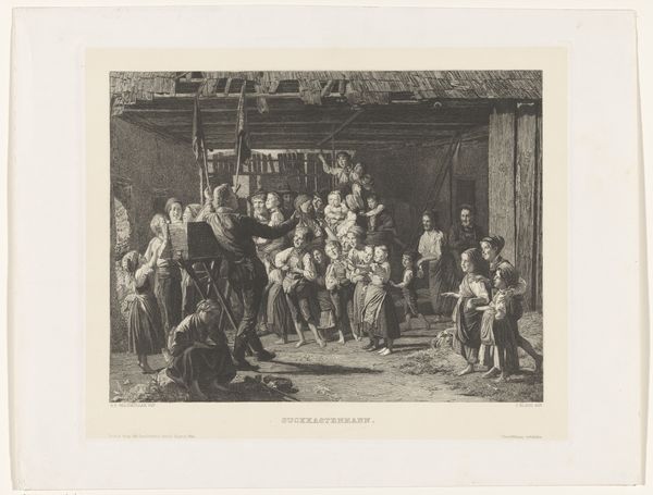
# print
#
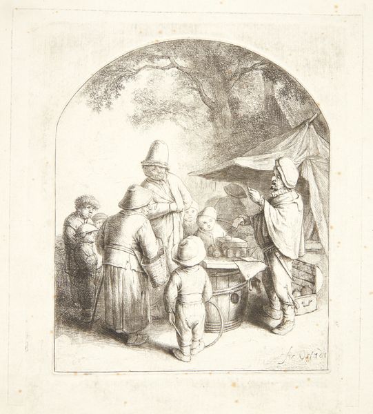
etching
#
etching
#
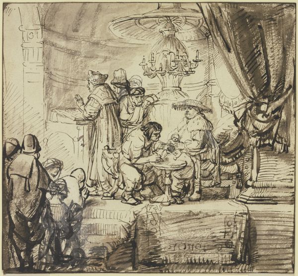
ink
#
genre-painting
#
engraving
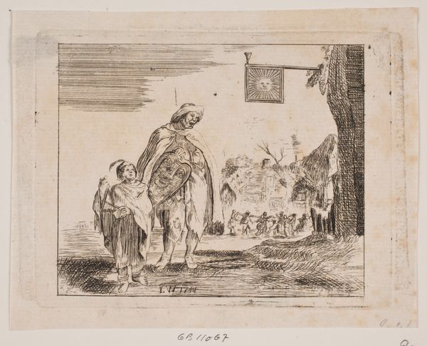
Dimensions: 97 mm (height) x 127 mm (width) (plademaal)
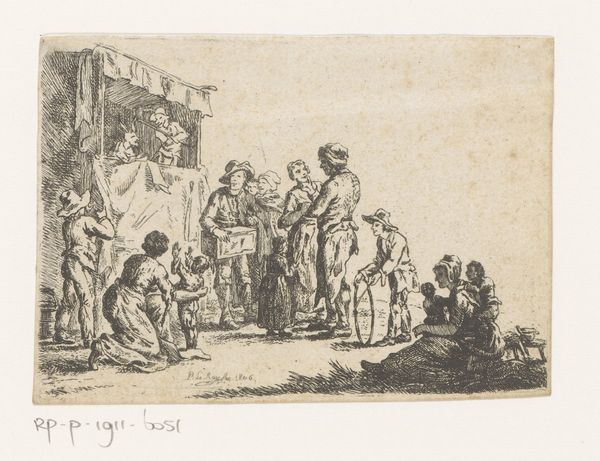
Editor: So, this is "En lirespiller," made in 1744 by J.W. It's an etching, and it shows a somewhat odd scene – an adult and child near what looks like a group of dancers. The mood seems almost dreamlike because of the way the figures are drawn. What compositional elements stand out to you? Curator: Notice the stark contrast in textures and detail. The foreground figures, rendered with a tight network of lines, establish a clear focal point, juxtaposed against the blurred background. The engraver used hatching and cross-hatching very methodically to suggest depth. The composition is also quite fascinating – the figures are asymmetrically placed. What is the effect of this imbalance? Editor: It definitely adds to the feeling of instability; nothing is quite settled. I wonder if the artist was deliberately trying to throw us off balance? Curator: Precisely! Consider also the line quality: precise, controlled strokes versus the looser, more suggestive marks depicting the background revelers. The use of line emphasizes a conceptual divide between the distinct figures in the front, and those less-defined individuals in the rear. Notice how the bright 'sun' above the figures helps to emphasize that divide. Editor: I see that now. I was initially drawn to the people in the front, but the repetition of lines to form figures really tells its own story too. Thank you for making me look closer at the construction. Curator: My pleasure. A formal reading opens a pathway into understanding artistic intention; hopefully, it helps sharpen your focus and visual acuity when you explore other works!
Comments
No comments
Be the first to comment and join the conversation on the ultimate creative platform.
More like this