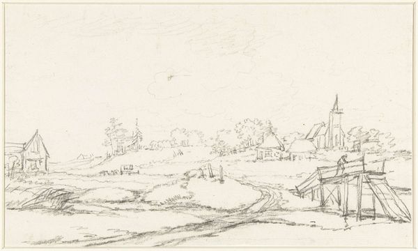
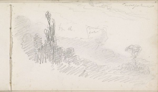
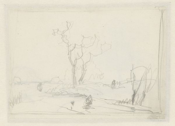
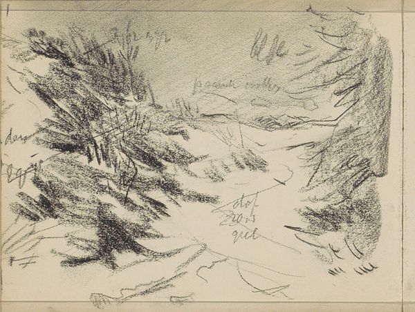
drawing, pencil
tree
drawing
pencil sketch
landscape
pencil
sketchbook drawing
realism
Copyright: Rijks Museum: Open Domain
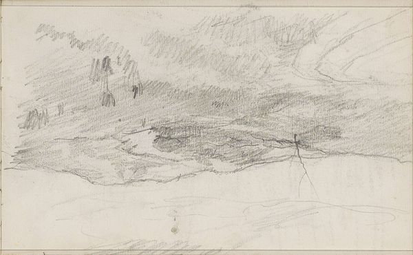
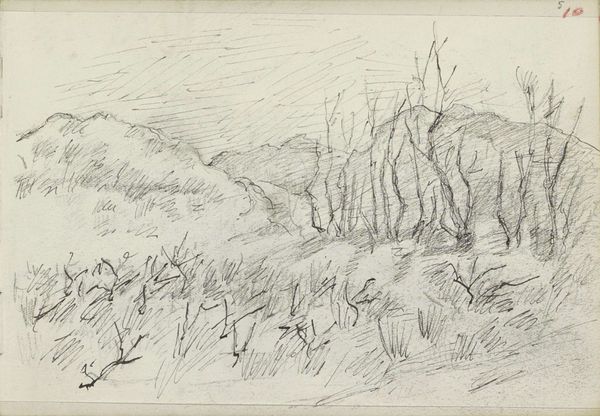
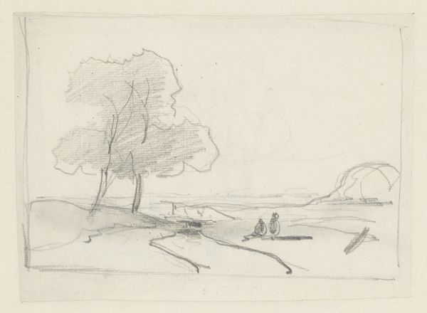
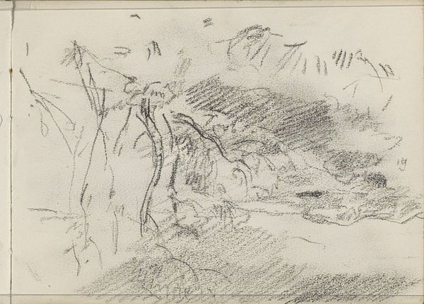
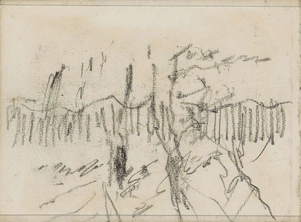
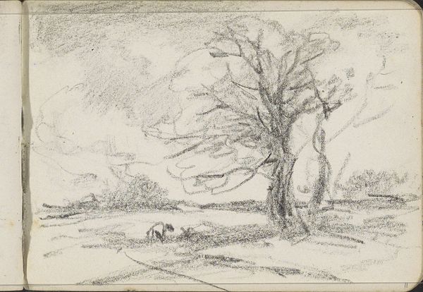
Editor: This is "Landschap met bomen," or "Landscape with Trees," by Anton Mauve, likely created between 1848 and 1888. It’s a pencil drawing at the Rijksmuseum. I’m really struck by how simple the composition is, yet it feels very evocative. What do you see in this piece? Curator: The visual architecture of Mauve's landscape centers around a study in contrasts. Consider the textures: the chaotic scribbles suggesting foliage against the smoother, more uniform hatching depicting the land. These differing marks articulate form and depth. Do you notice how the distribution of tone and density influence the perception of space? Editor: Yes, I see that! The darker areas make the trees feel like they are looming forward. So the composition isn’t just about what is depicted, but how. Curator: Precisely. Observe how the formal elements interact: line, tone, and texture, existing in a dynamic tension. There’s a deliberate use of empty space around the tree forms. How do you perceive this choice? Does it contribute to the reading of the subject, perhaps underscoring an atmosphere or quality of isolation? Editor: It does. I hadn’t thought about the negative space, but it focuses my eye, creating a kind of solitary mood around these sketched forms. It also emphasizes the materiality of the paper. Curator: An excellent observation! Mauve seems less interested in rendering a scene naturalistically and more focused on exploring the interplay of line and form through a distinct mode of inscription. A kind of visual poetics emergent from these carefully considered compositional structures. Editor: I can see that, thanks. It’s taught me to look more closely, not just at what's *in* the picture, but how it is rendered. Curator: It is indeed the careful arrangements of forms, and attention to texture which is the main contribution of this sketch.
Comments
No comments
Be the first to comment and join the conversation on the ultimate creative platform.