Copyright: Public Domain
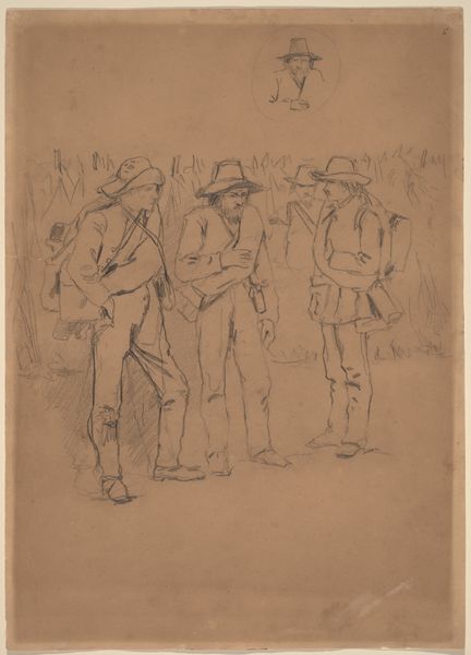
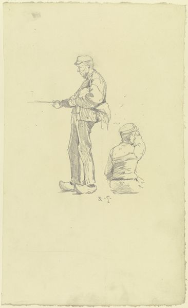
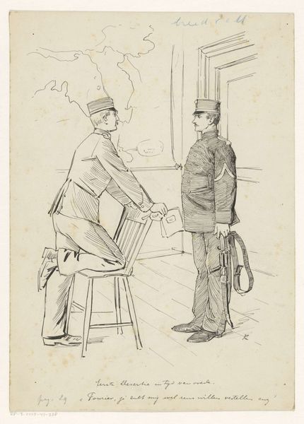
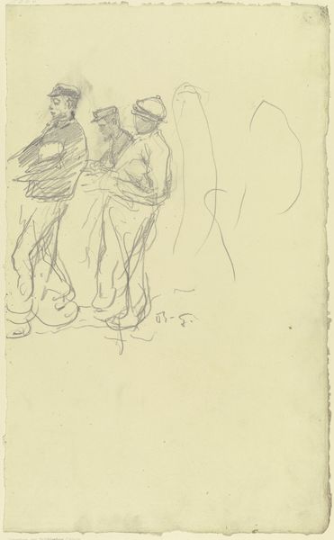
Editor: Here we have Wilhelm Amandus Beer's pencil drawing, "Verlesung einer Kriegsdepesche" from 1870. It feels unfinished and immediate, but somehow monumental because of the artist’s touch. What is your take on this study? Curator: Notice how the tonal range, limited as it is in pencil, skillfully articulates the distinction between forms. The arrangement of figures directs the viewer's eye toward the central figure holding what one presumes is the titular dispatch, but does this staging truly highlight the importance of such a pivotal historical narrative, or does it intentionally obscure the precise details? Editor: It’s true that the details are soft, and some features seem absent, like the lack of interior space. The drawing technique also keeps it from having a narrative focus. So how do we make sense of these stylistic choices? Curator: Consider the gestural quality of the drawing. Note how the artist has rendered their forms. The attention seems drawn to their clothing and social station. Editor: Yes, it’s very representational. The men's apparel does seem significant, creating a clear hierarchy. Would you say this piece relies heavily on this visual hierarchy to communicate its message about war and class? Curator: Precisely. It's this visual scaffolding, more than any overt symbolism, that provides structure and tension within the drawing. How effectively that structure communicates the nuances of war and class is open to further consideration, don’t you agree? Editor: Absolutely. I'm leaving this with a richer sense of the artistic intention just through the visual components. Curator: Agreed. It demonstrates the power of close visual analysis. The artwork really encourages discussion surrounding not only the visual components within art but also of history itself.
Comments
No comments
Be the first to comment and join the conversation on the ultimate creative platform.
More like this