Copyright: Gene Davis,Fair Use
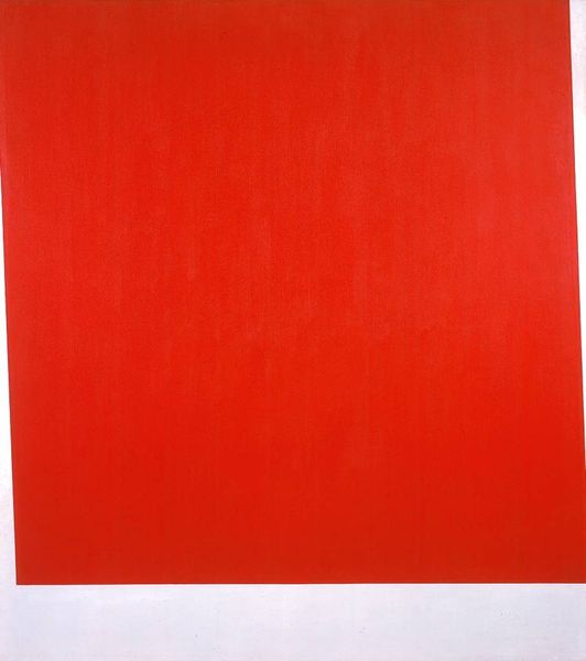
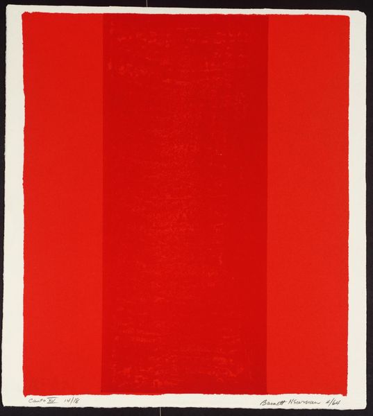
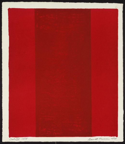
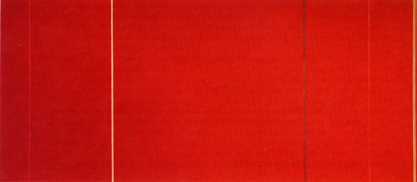
Curator: Before us, we have Gene Davis's "Red Baron," an acrylic painting from 1978. What are your first thoughts? Editor: Stark. Severely balanced. Two almost identical red fields separated by a crisp vertical line. There is also this off-white or cream-colored frame within a frame. It gives the red more pop, and its rough texture contrasts nicely with the smoother surfaces. Curator: And perhaps not just visually striking. "Red Baron," the title, evokes powerful historical associations, doesn't it? The First World War ace pilot, known for his red aircraft, becomes an almost totemic figure. Does Davis use the color to reference that period? Editor: It could allude to that history, sure. But focusing on form alone, it's striking how the subtle variations within each field create a vibration, an optical illusion, wouldn't you say? The density and saturation are different enough to cause the eye to work overtime. Curator: Precisely. The history resonates with the form in order to explore form. These bands are a repeated motif in Davis's work, often seen as an exploration of seriality, but it's in this interplay where the artist achieves visual, cultural, and, yes, even emotional reverberations. One almost feels a historical weight from two colors interacting. Editor: Do you find this "weight" because the piece’s title alludes to history? Isn’t that a subjective attribution? Or is it an effect of these very hard-edged contrasts? I am not so sure. In this work, it is perhaps a formal strategy that carries more weight in the actual perceptual process than what the artist evokes with the title. Curator: And yet, perhaps this is the work's magic trick: intertwining personal historical awareness and purely aesthetic apprehension. Davis invites you to ask what those simple reds mean, which then lets you realize what the material of color can do. Editor: Well, on second thought, I will say I did not expect to have any strong feeling from such an elemental piece, but these subtleties, particularly that slight disjunction of color, held me longer than expected. Curator: Indeed. It seems we’ve found how even apparent simplicity holds multifaceted depths.
Comments
No comments
Be the first to comment and join the conversation on the ultimate creative platform.
More like this